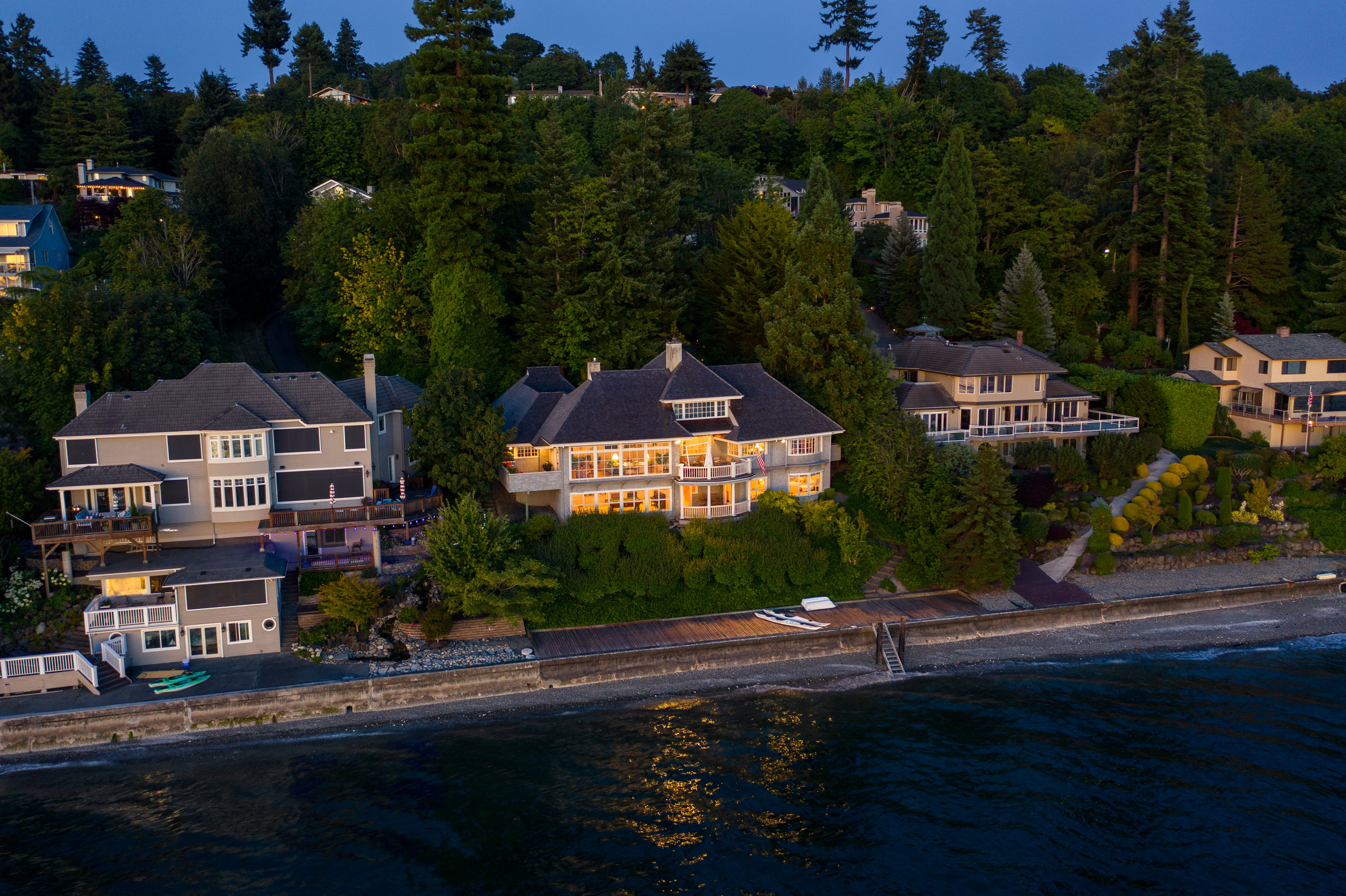
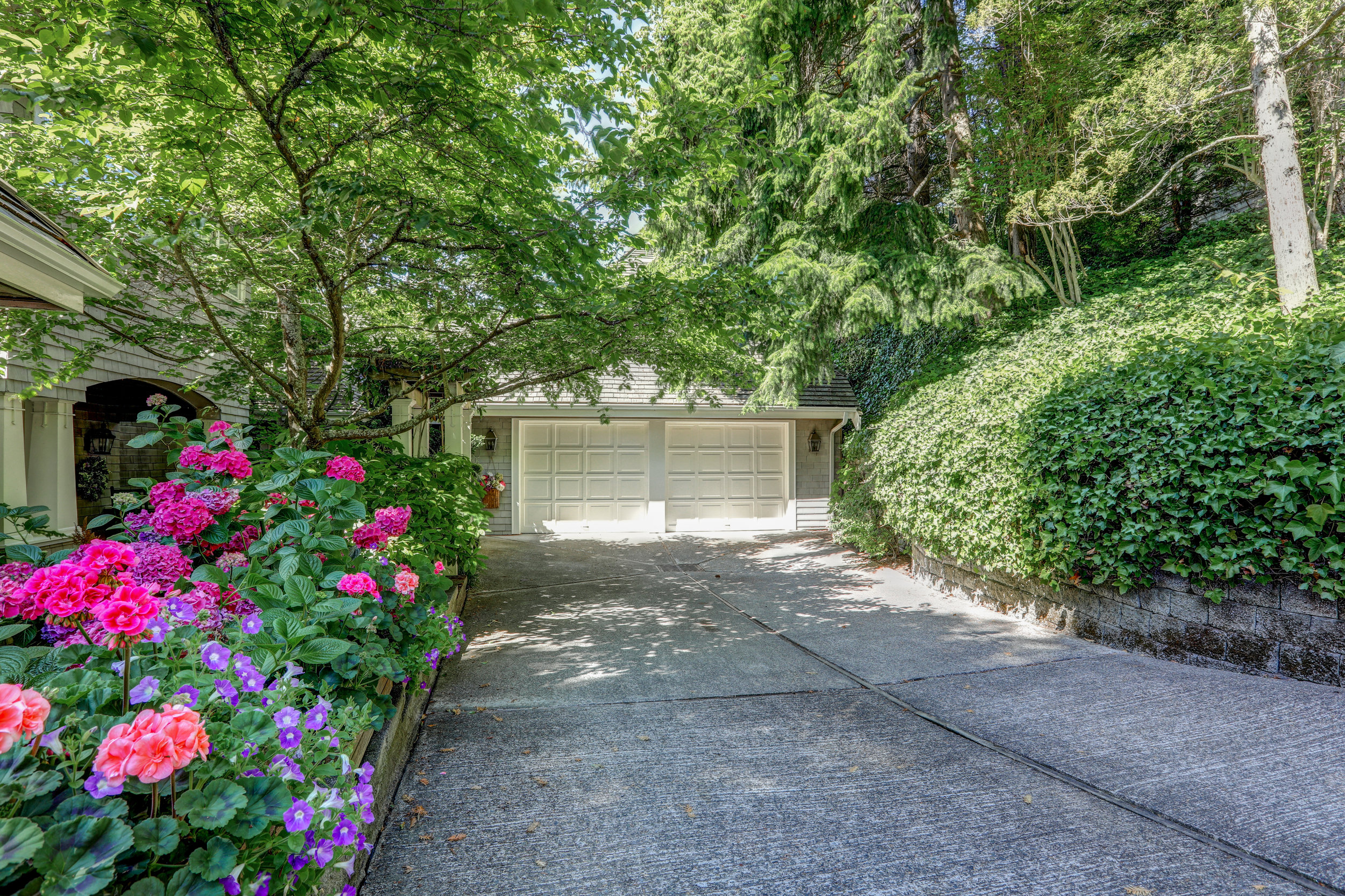
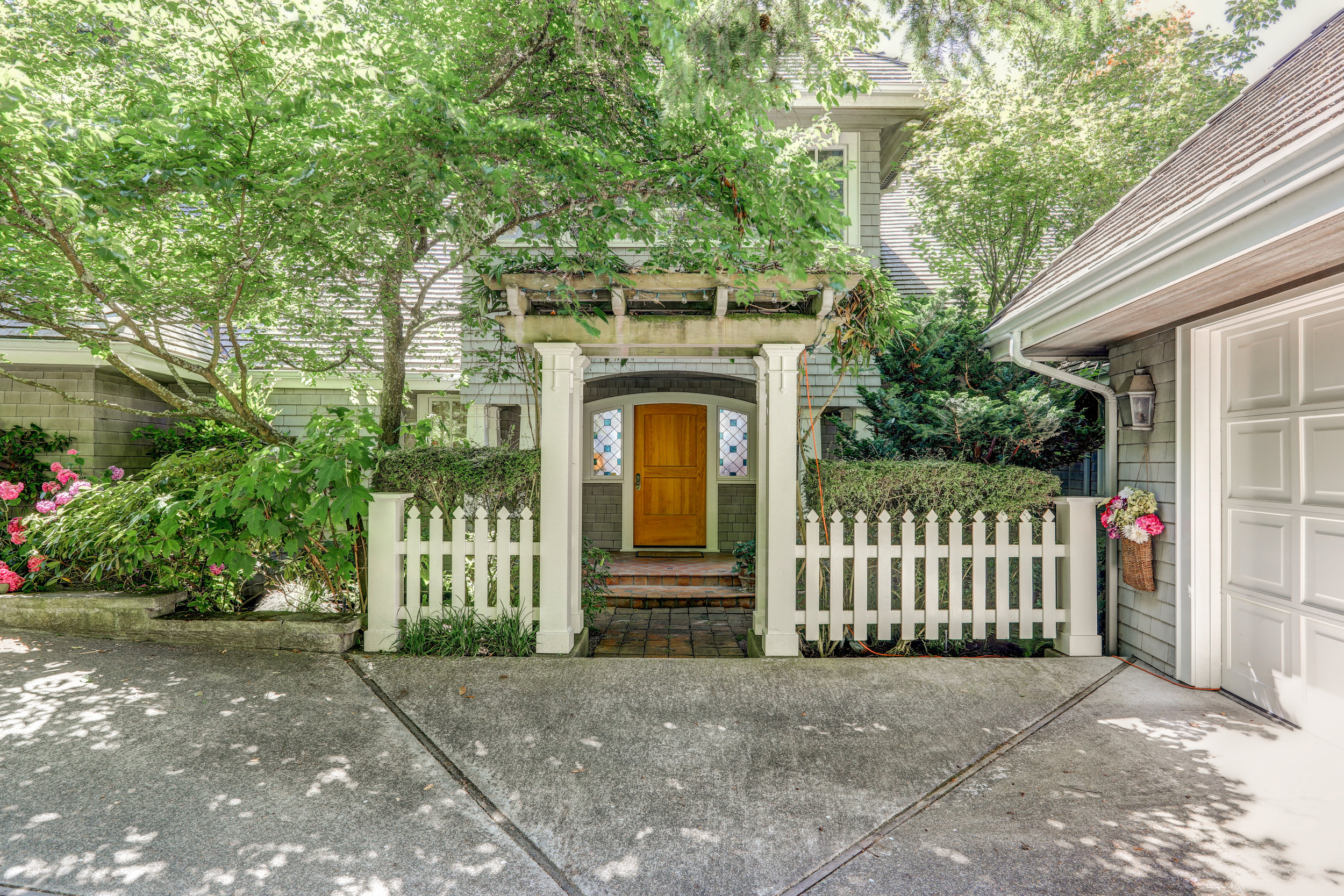
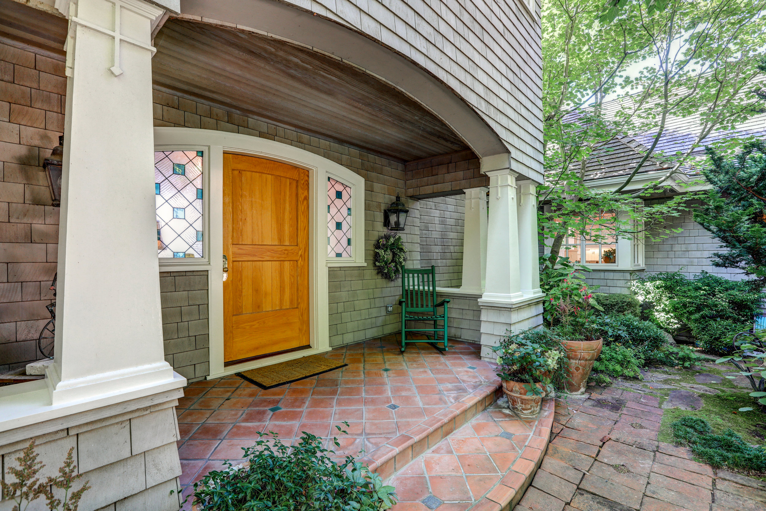
My client needed an addition to her website that showcased all of the amazing work that she does on the waterfront. Her passion is the Island life and she works with clients who have the same love. Our goal was to create a simple space where her clients could go to learn about the area, the selling options and homes that are ready to find their new owners. We added notes about the local schools, places to visit and why you’d want to live on Bainbridge (spoiler alert - it’s because it’s gorgeous!) We added in the data from Windermere’s Gardner Report and showcased that it’s currently a sellers market and Karen is currently using that data to entice her newest clients. We’re beyond proud to be a part of this super cool idea for her website and her business.
ABLE Environments | ACCESSIBILITY. LUXURY. UNIVERSAL DESIGN.
Real Estate Brokers, Barry Long and Tom Minty, believe that everyone should have the opportunity to find a home that fits their needs.
I am so freaking proud to be able to play the designer to their brilliant business plan. In 2017, Tom Minty and Barry Long joined the marketing power and resources of their brokerages and life experiences to create a truly unique real estate partnership that is ABLE Environments. Through this partnership, Tom and Barry strive to meet their client’s demands for accessible housing now and in the future, for our aging population, and people of all abilities.
The initial step in making their vision a reality, was the creation and launch of searchable criteria for accessibility home features, with a prominent display in the Multiple Northwest Listing Service, the first of its kind in the nation.
Building on this direct knowledge and momentum, ABLE Environments is dedicated to being the resource for buying, selling, and marketing homes that fit their client’s specific needs, with benefits for everyone. Whether you’re looking to buy, build, remodel, or renovate, ABLE Environments has the inventory of homes, networks, and partnerships throughout the real estate industry to find the right solution for you.
My Amazing Clients: Holiday Lighting
Custom Ad Design, Summer 2019
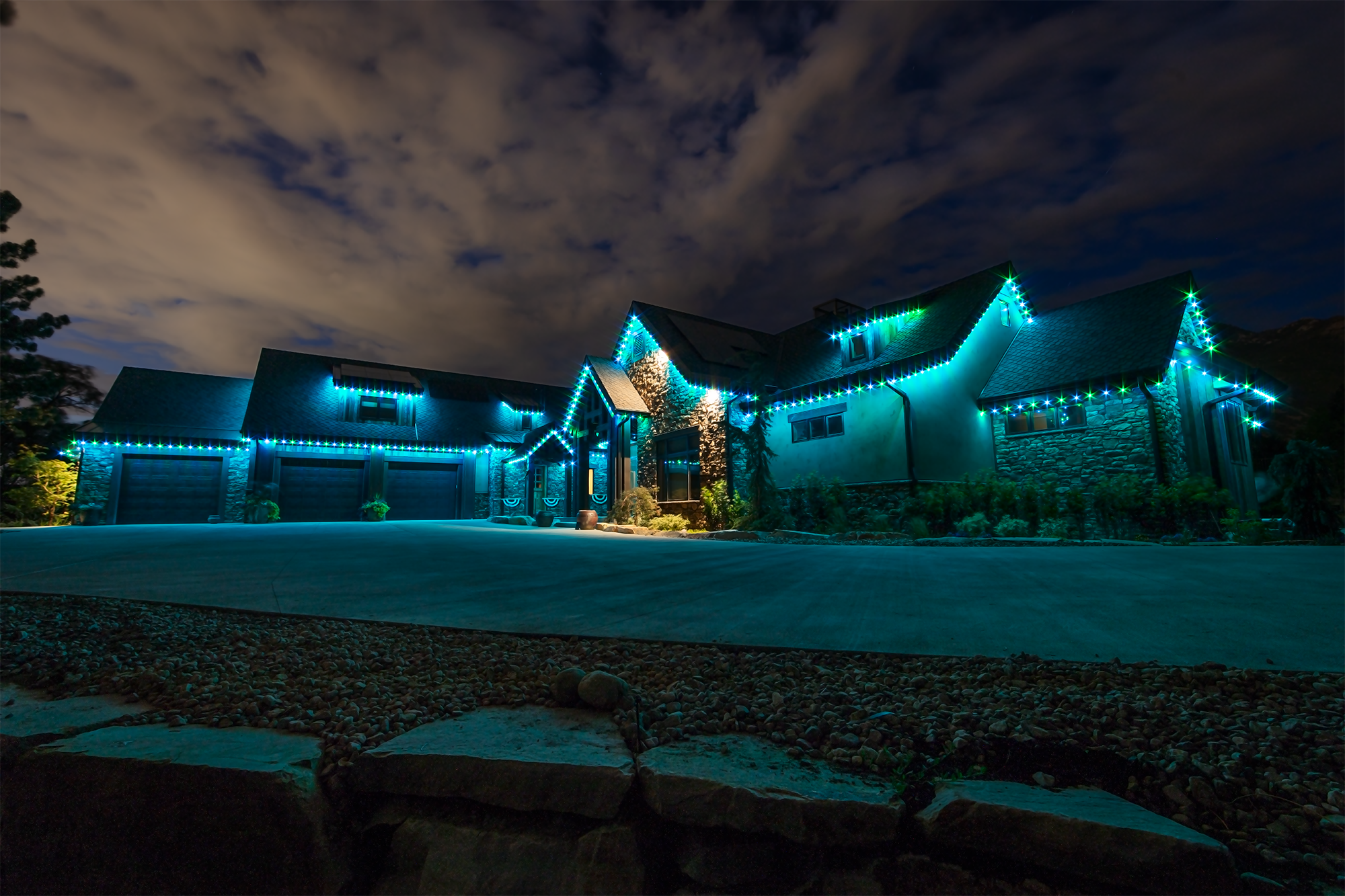
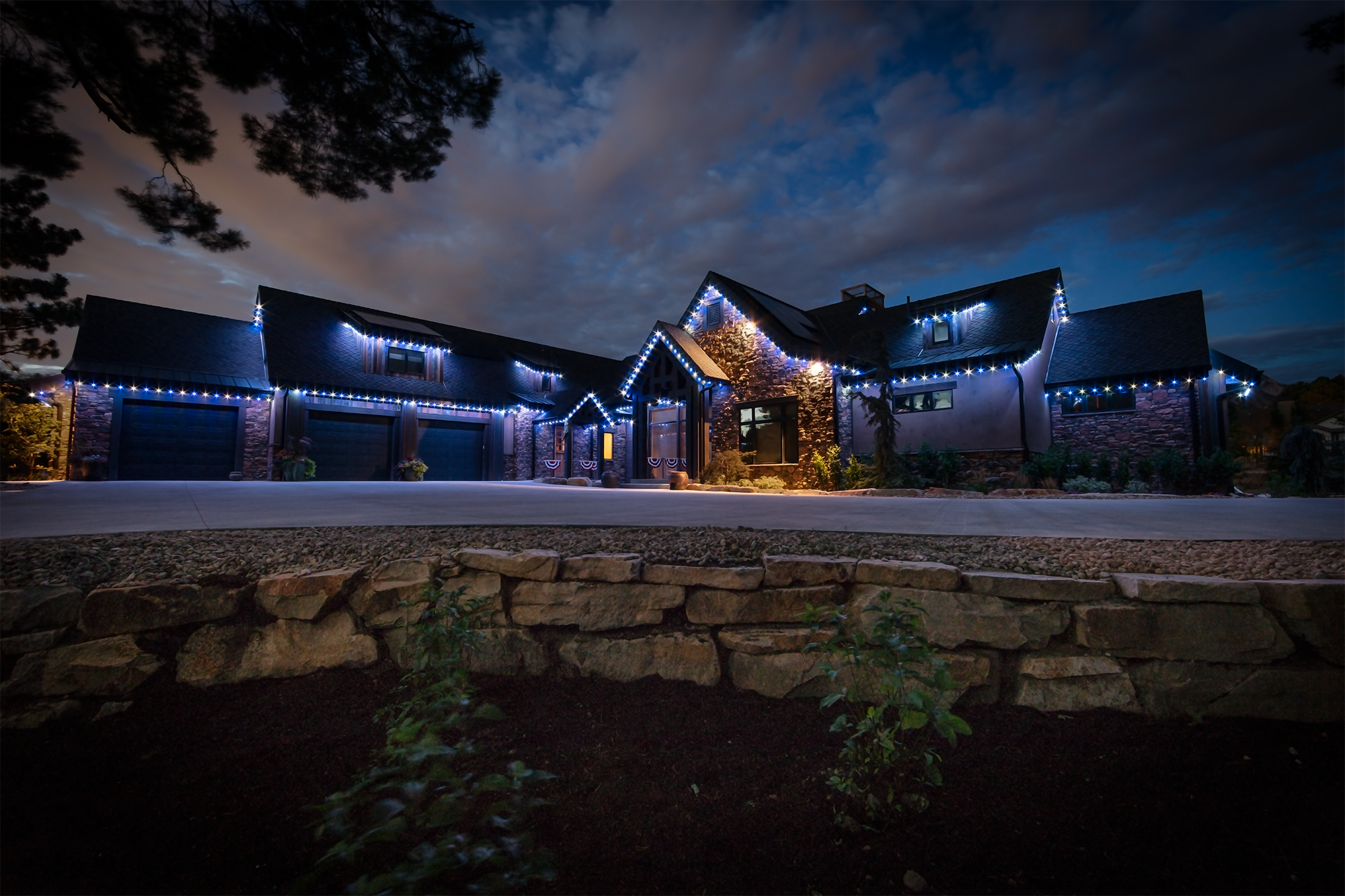
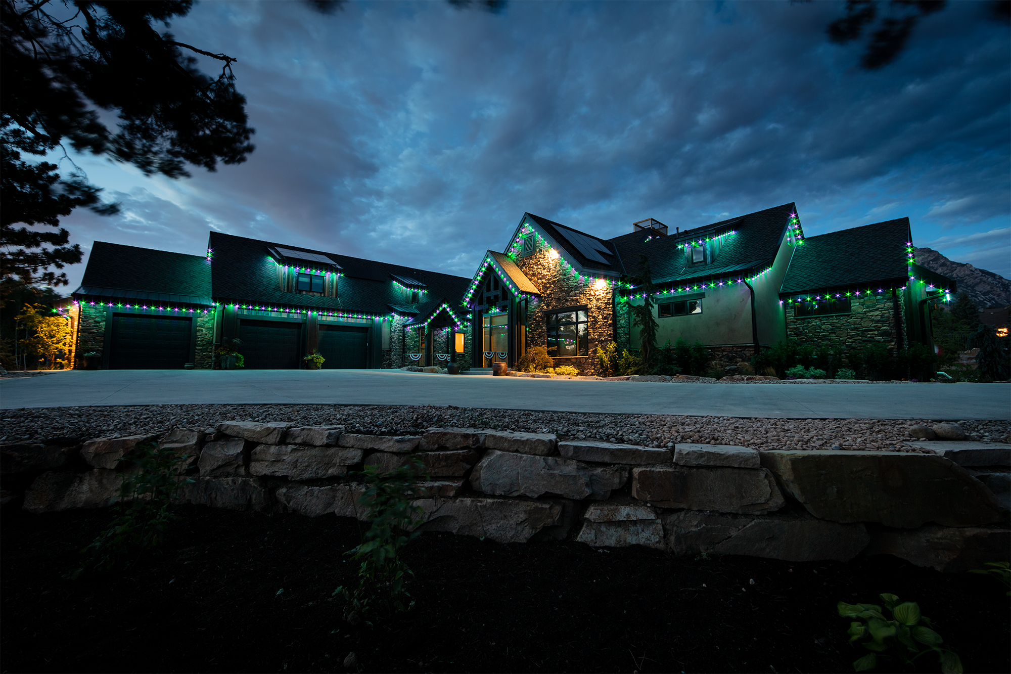
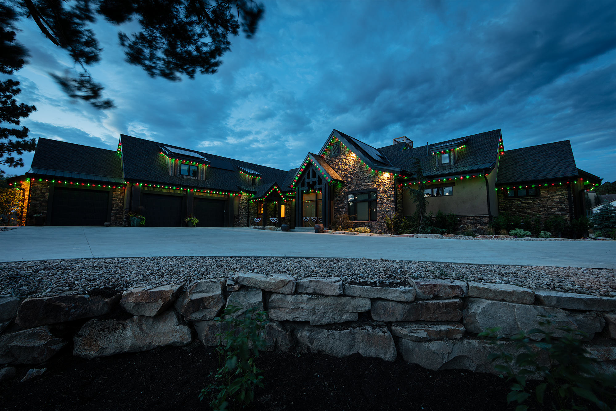
As the holiday season starts to ramp up, the list of “must-do’s” gets longer and longer. And if you’re a real estate agent, trying to squeeze a few more sales out of the year, the list can seem overwhelming. My team works with some of the coolest companies, and the most amazing people and I wanted to take this opportunity to showcase one of my clients this year who may just be able to help tick a few items off of your to-do list.
So here goes: check out Trimlight!
Imagine your buyers pulling up to the most brightly lit house on the block, simply sparkling with holiday lighting. Imagine them seeing their holiday parties next year. Imagine the breath catching in their throat as they envision their holiday season, with family and friends and their new house covered in stunning lighting…magical, right?
Check them out here:
Autumn Blues | A Chat with Chad Zinda of Metropolist
Autumn Blues got you down? Here’s what to do:
Layout for Sales Success Postcard, Autumn 2019
Chad Zinda is one of the owners of Metroplist Group in the Seattle area, and he was kind enough to chat with me about what his real estate brokers lean towards during what the rest of real estate considers “downtime.” “The last 90 days of the year we take as a personal challenge - and it works.” With nearly $6.5 million in sales since October 1st, he’s not wrong! His team is rocking this last quarter.
I asked Chad if I could share our conversation and what he would suggest for design work during this downtime. “Remind your potential clients that buyers are looking during the holiday season. So many people would love to be in their new home before the holidays. Take advantage of it!” says Chad.
Ready to show off your sales this year?
Even a Handyman Needs an Remodel: Roof to Cellar Contractors, LLC
Steven Strain - or as he’s affectionately known by all his clients, My Hero, The Handyman - hung out a shingle in 2013 and has been doing all the handyman things from changing a lightbulb to adding on to homes and refurbishing apartments. Over the last two years, he’s gotten so much work that he’s taken on employees and has multiple teams out making handyman magic for his clientele.
It was time for an upgrade.
We wanted a brand that would translate to apparel, website, online marketing and, of course, the vans and signage. It needed to be clean, but solid and be a brand that his team would be happy to have on their t-shirts and workwear. It only took three rounds and we hit the right tone for his business! We rocked out an awesome website and Steven is thrilled! And, I have another amazing human in my toolbox that I can recommend for real estate audits!
So, if you’re in need of a handyman to do a walk through with you on the home that’s ready to go to market and just needs some love, I highly recommend Steven Strain and Roof to Cellar Contractors, LLC!
NEW TO MARKET | Westwind at Woodmont Beach
Summertime and the livin’ is easy…and getting easier!
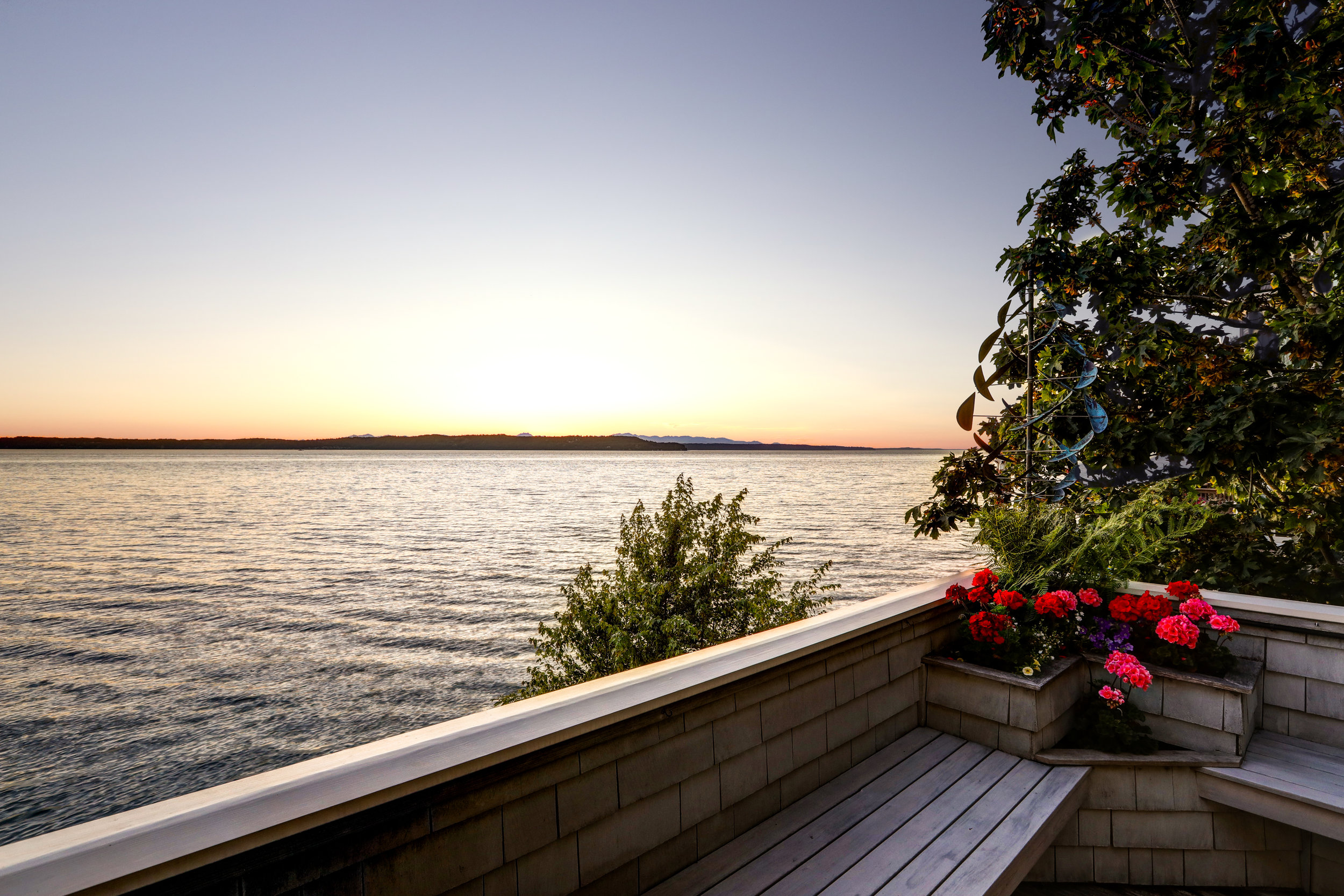
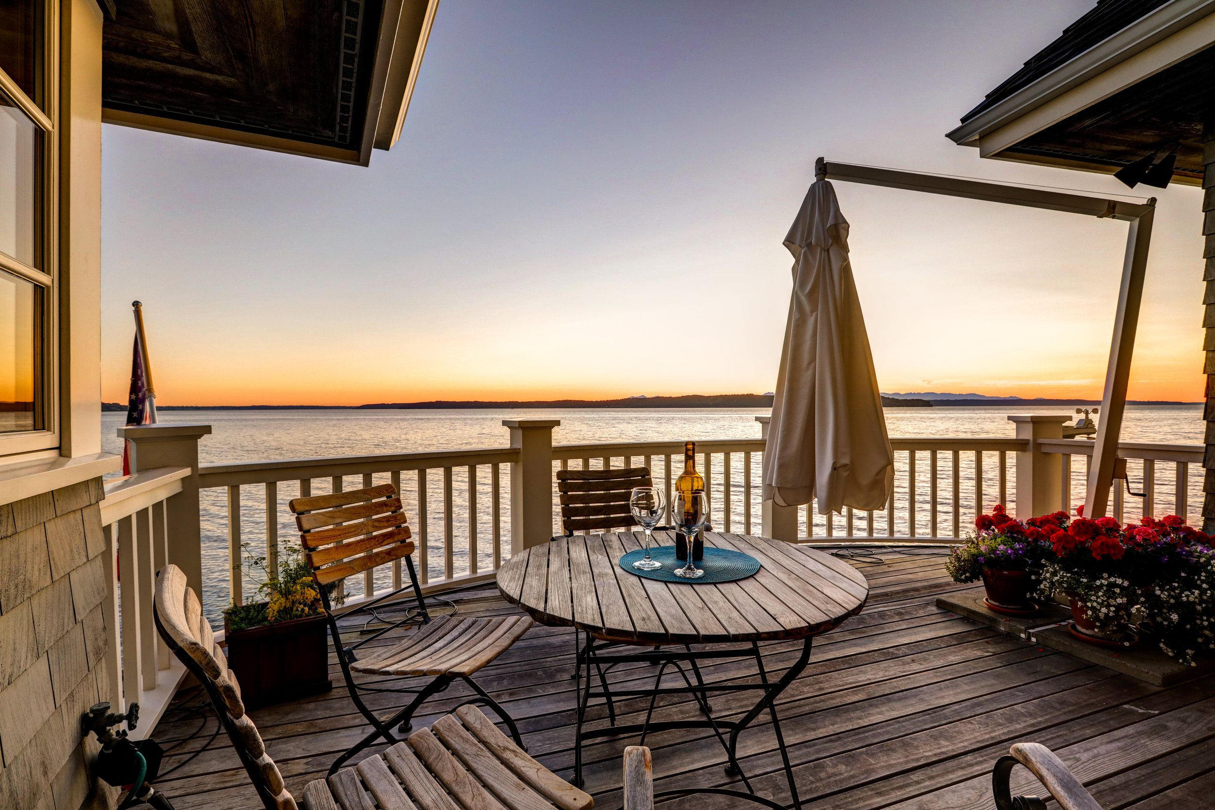
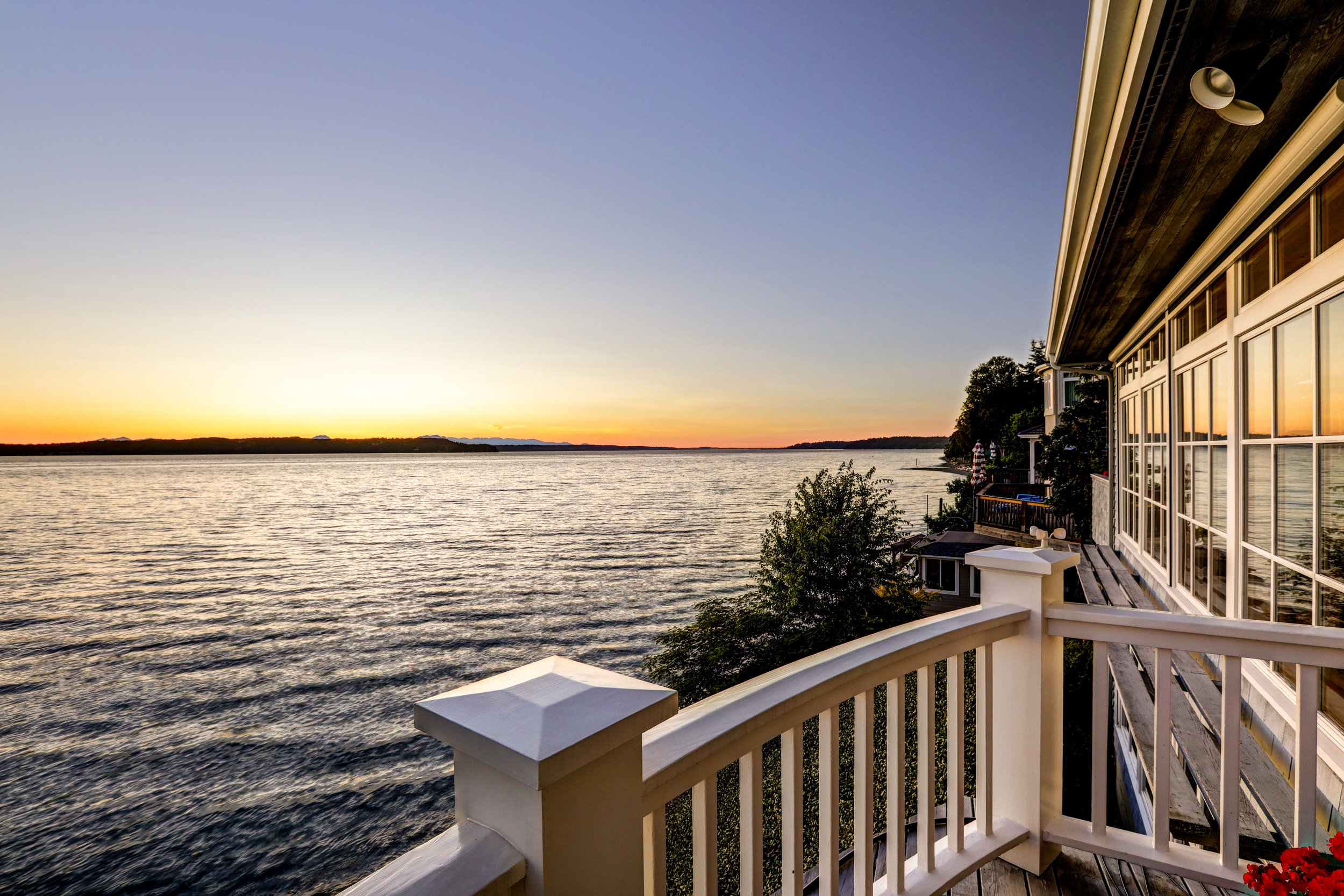
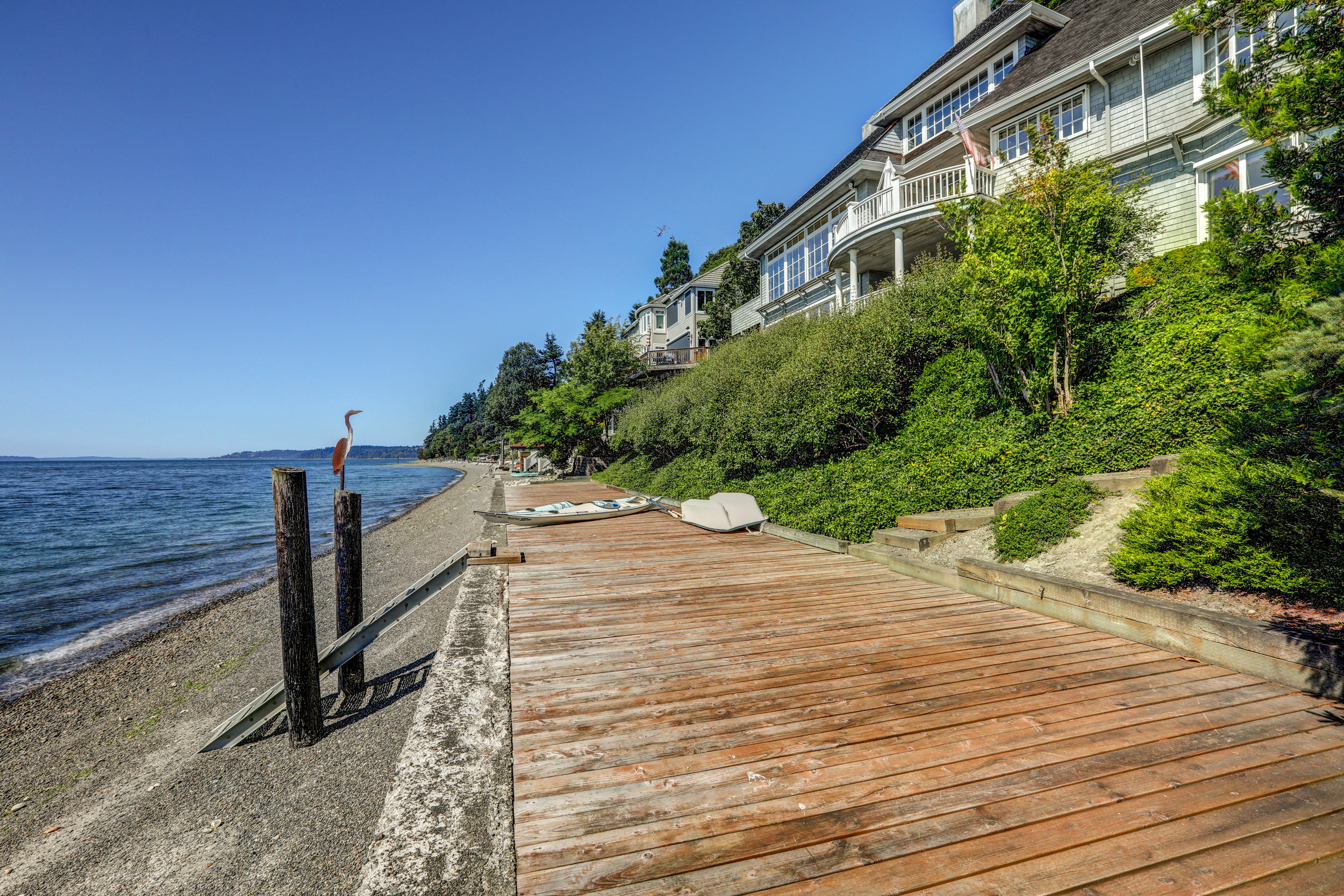
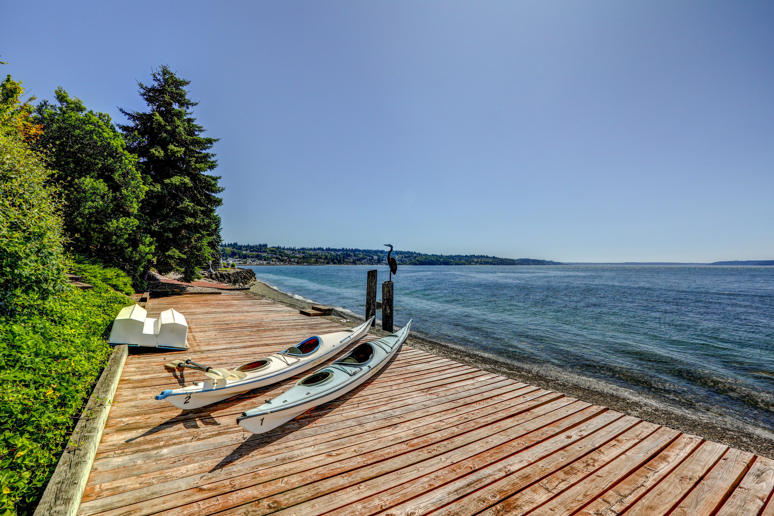
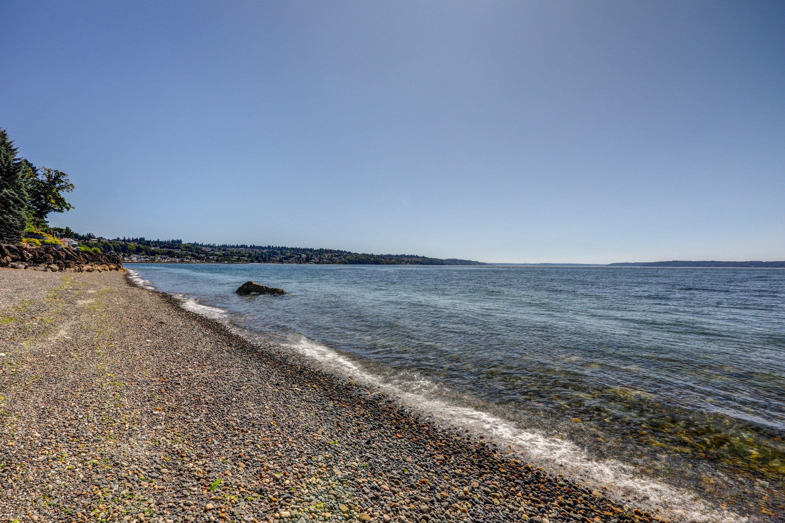
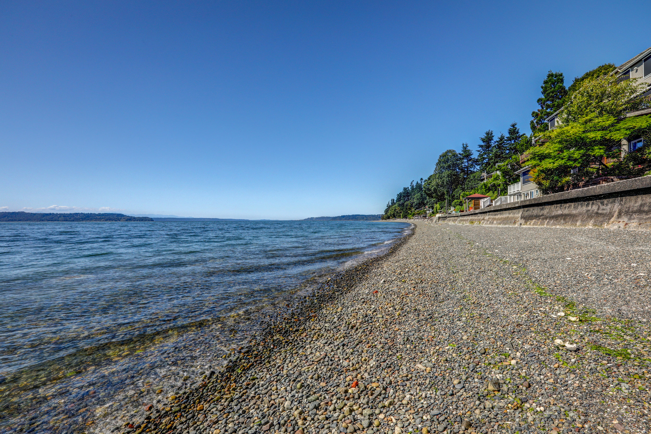
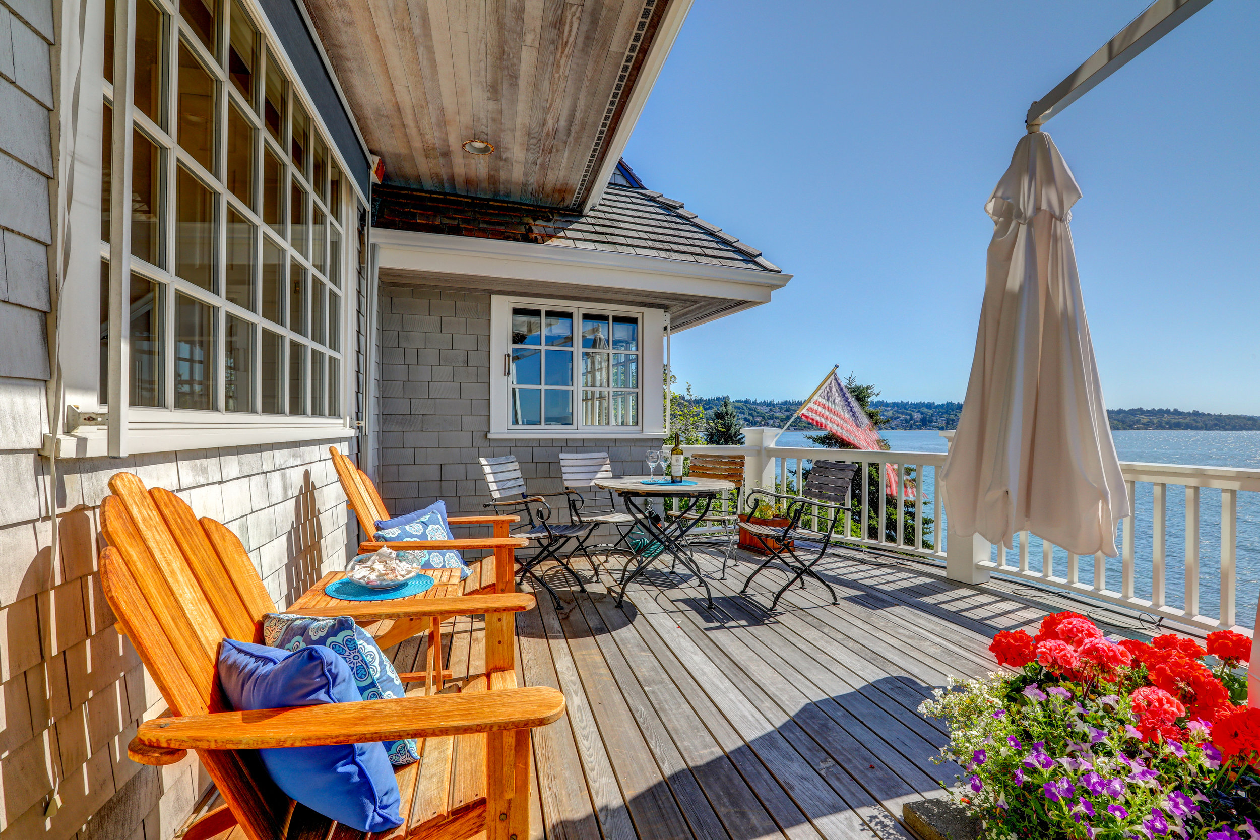
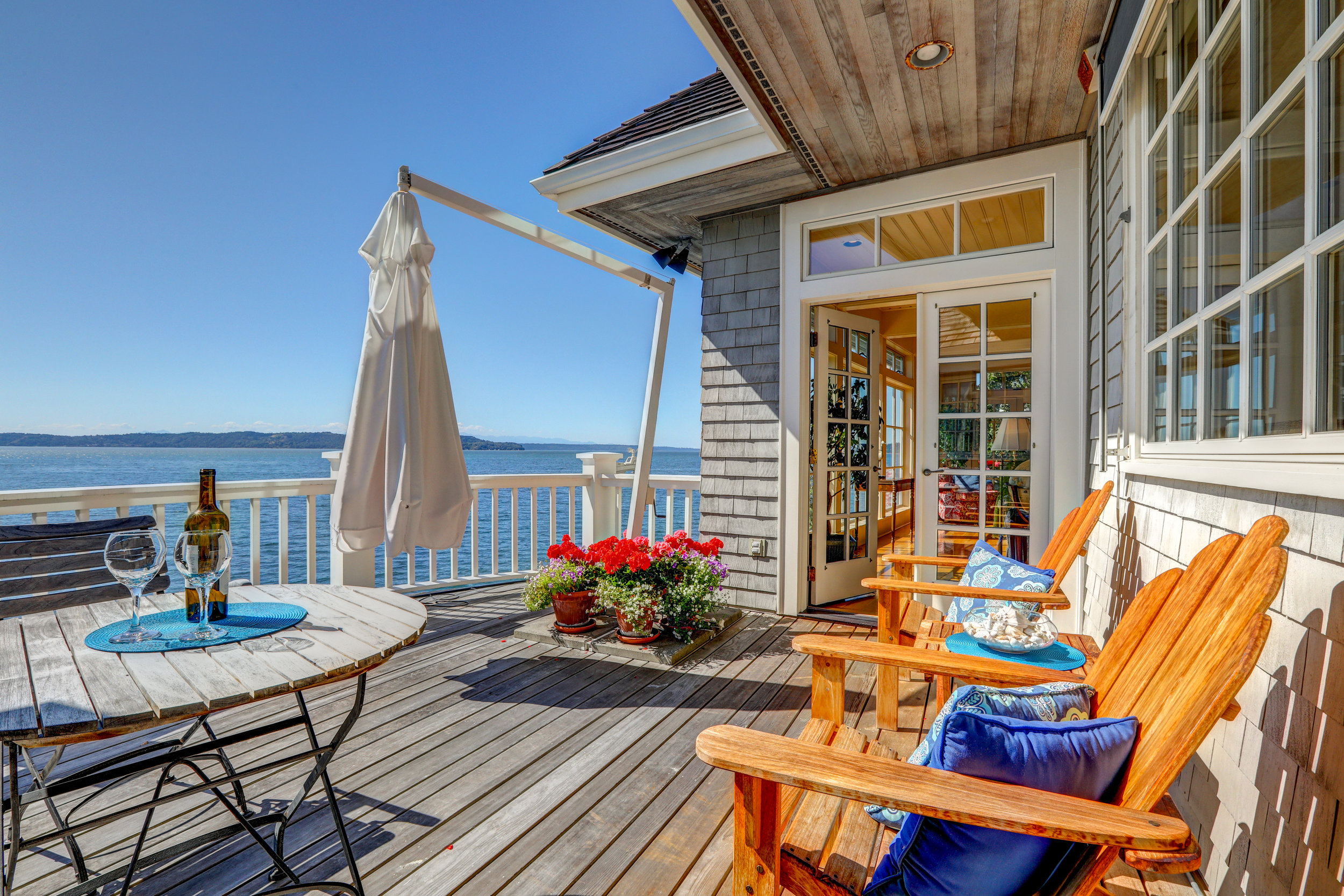
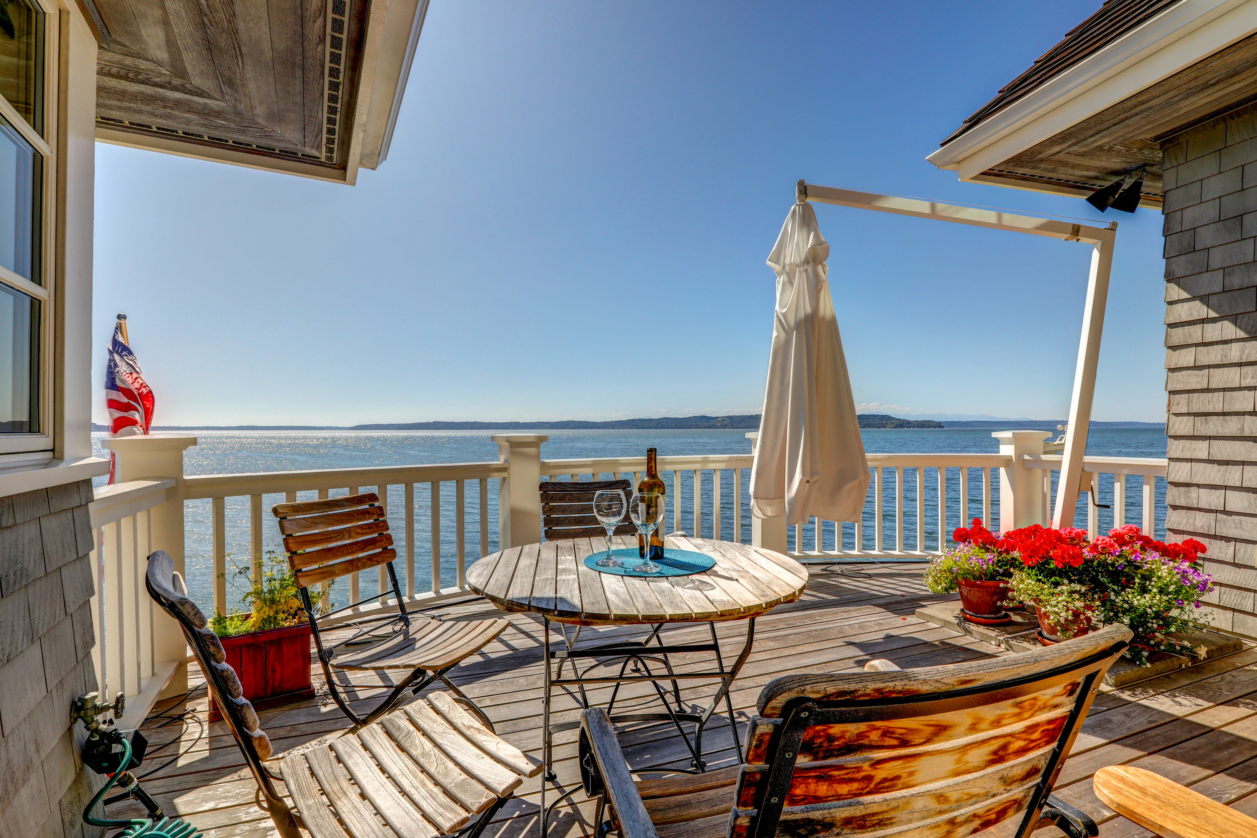
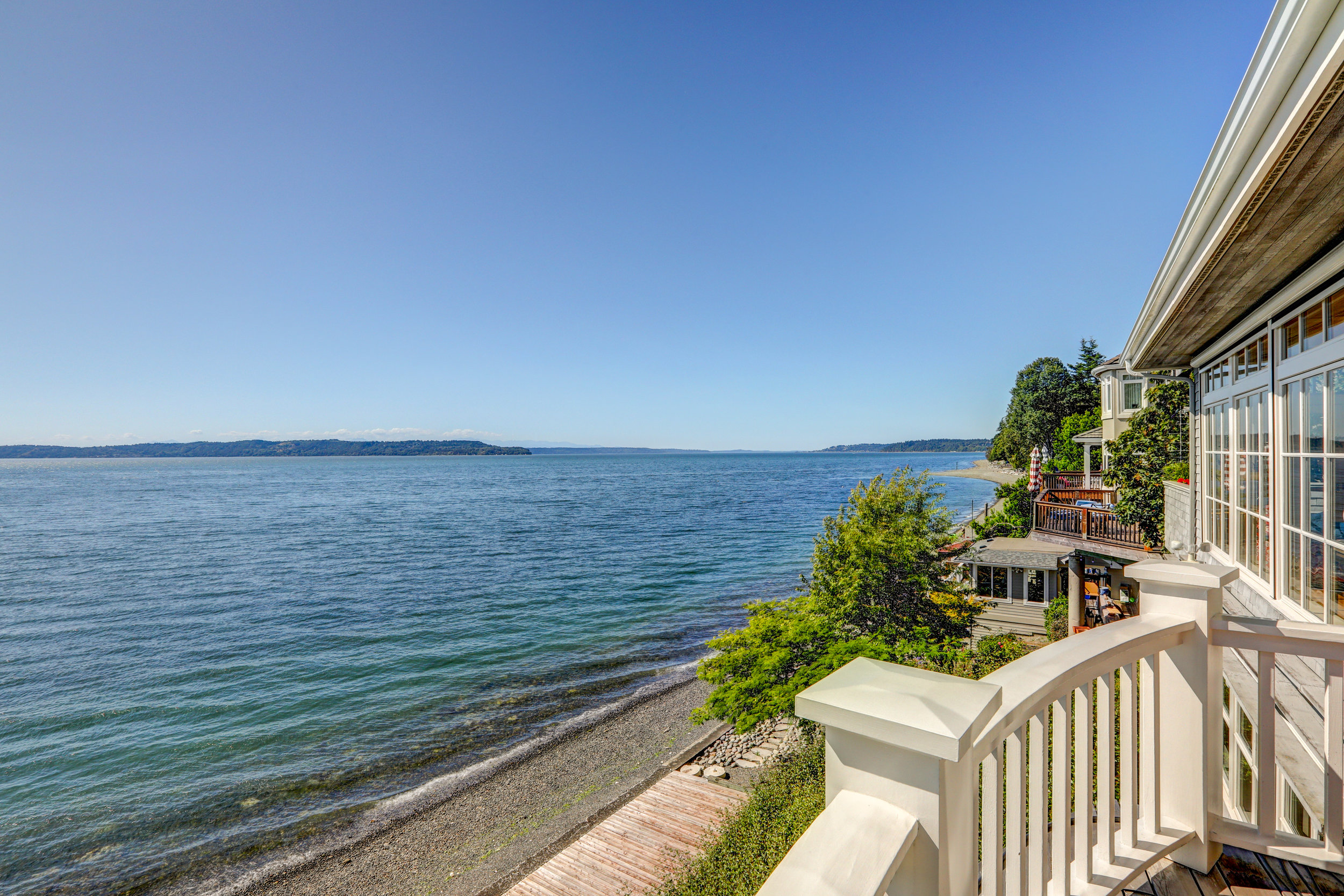
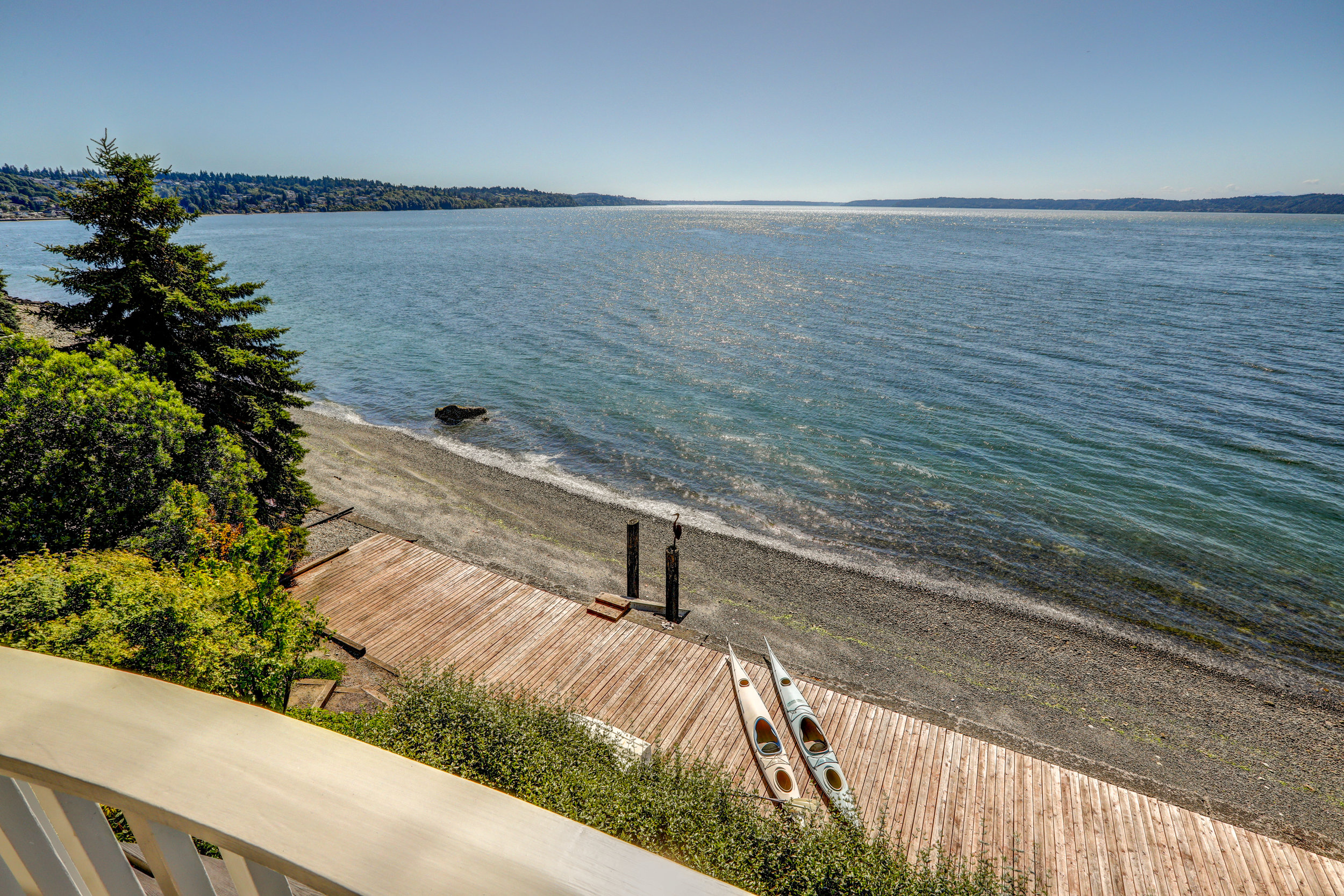
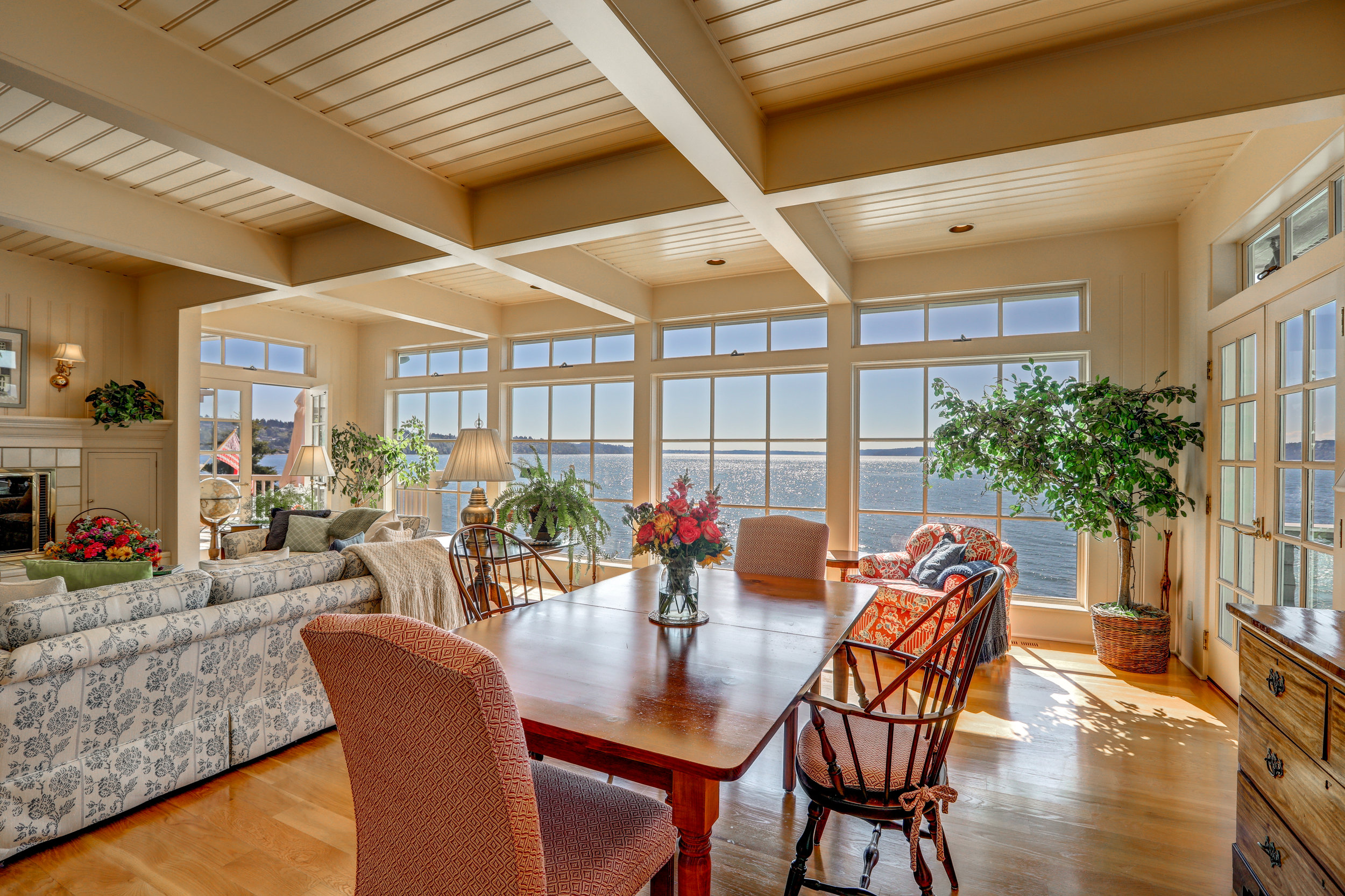
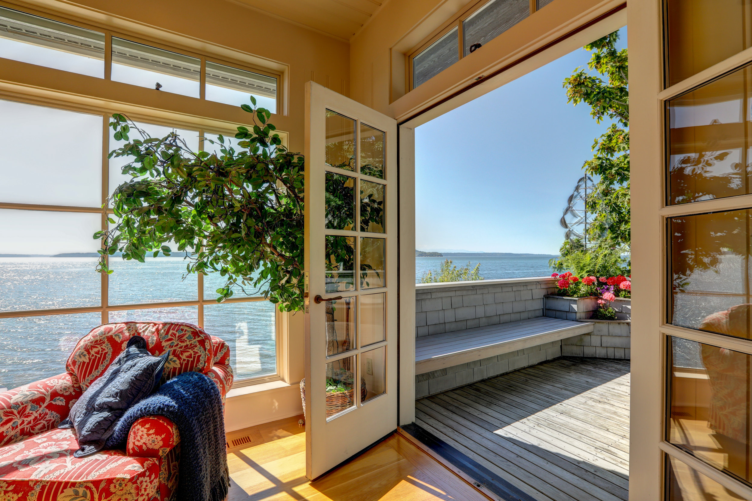
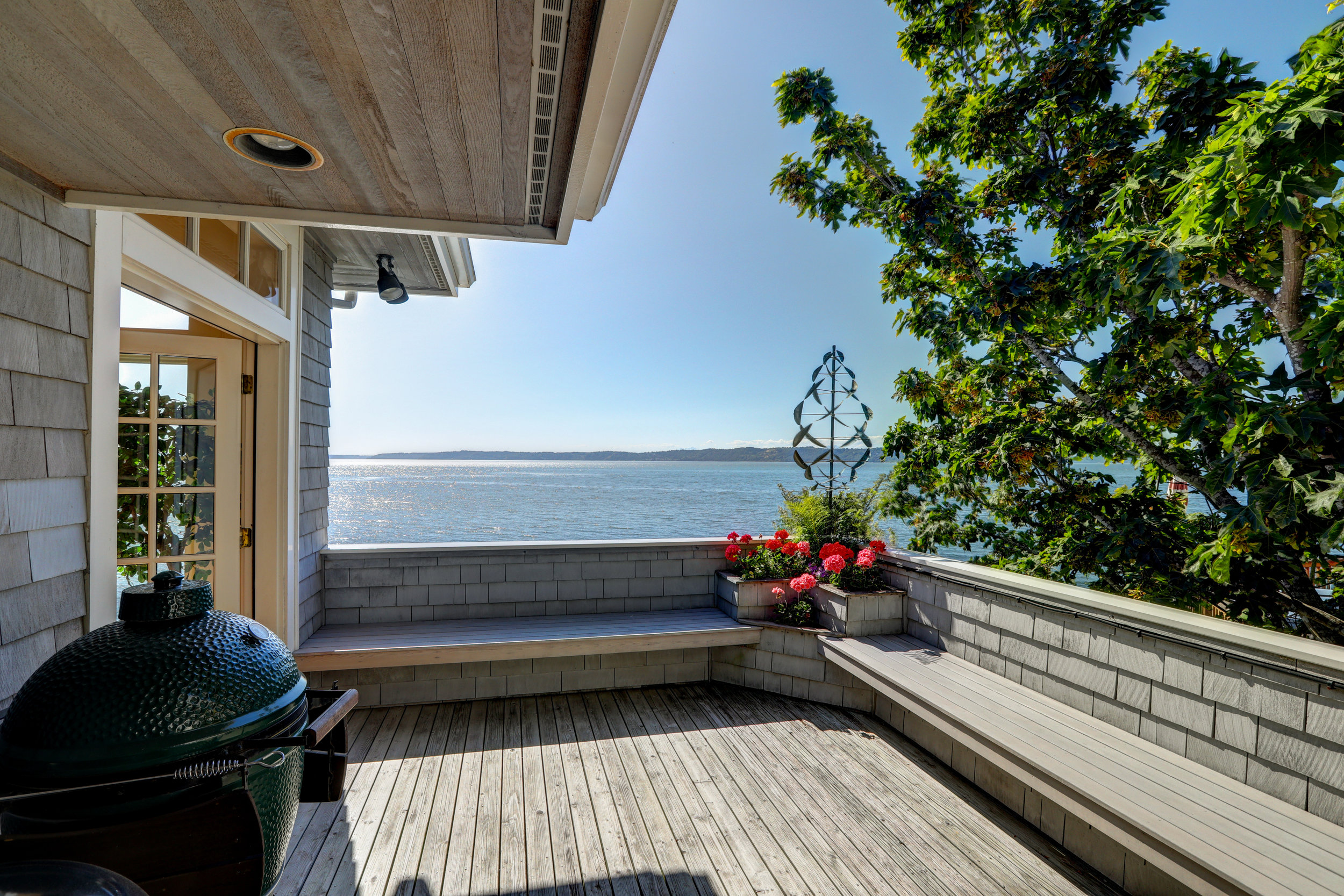
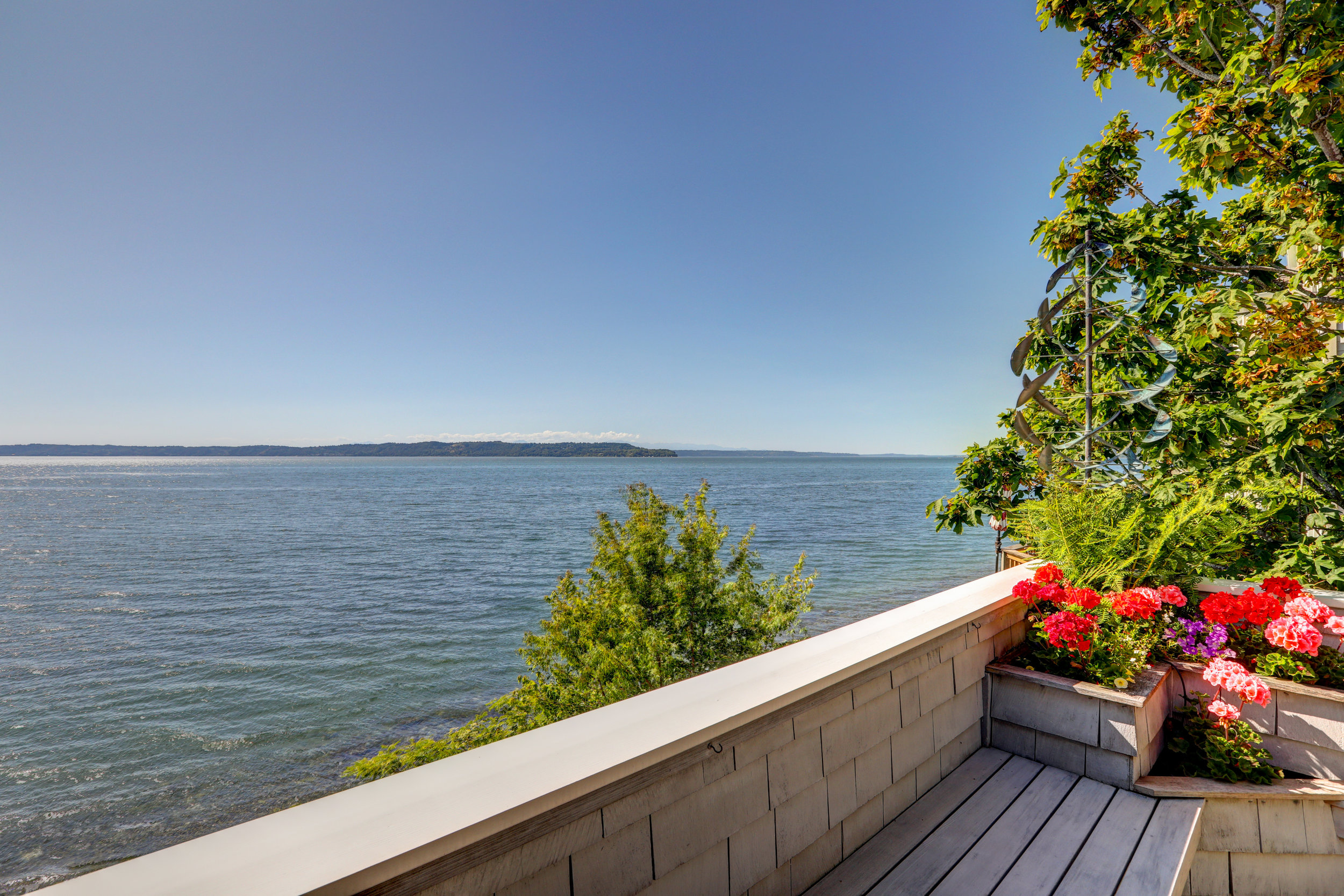
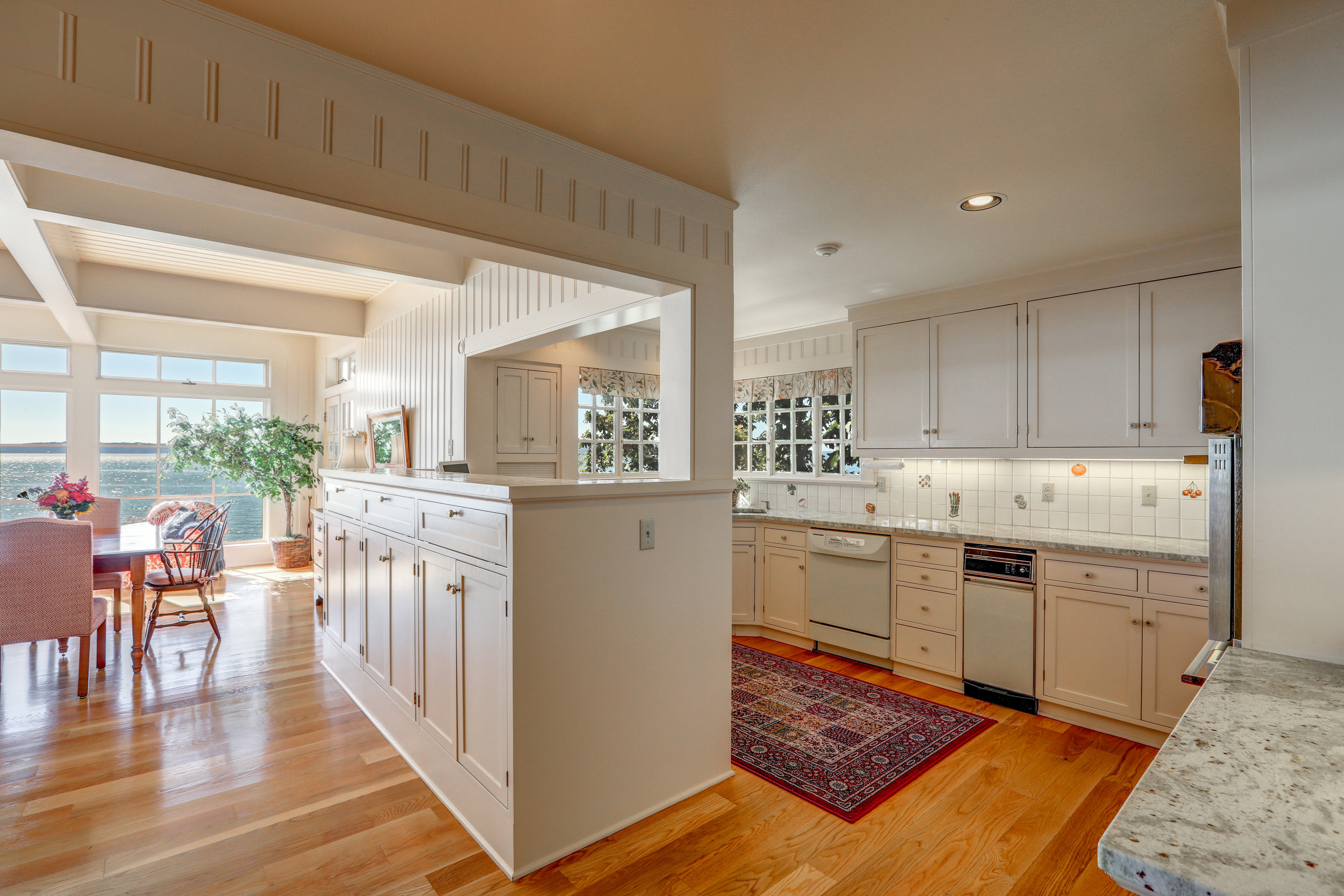
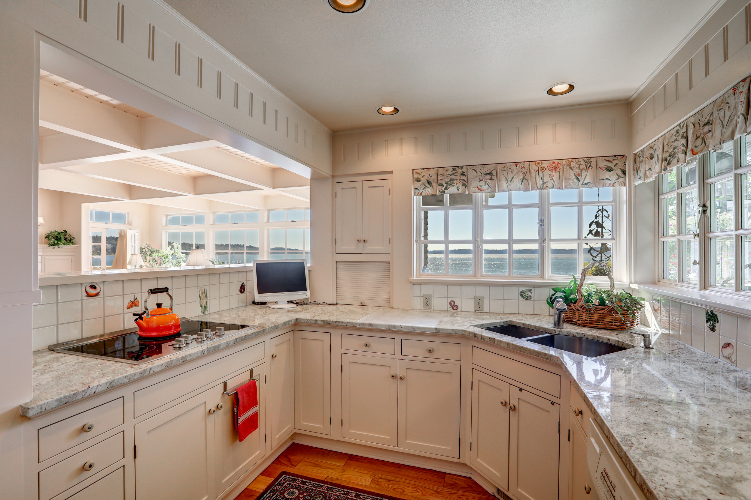
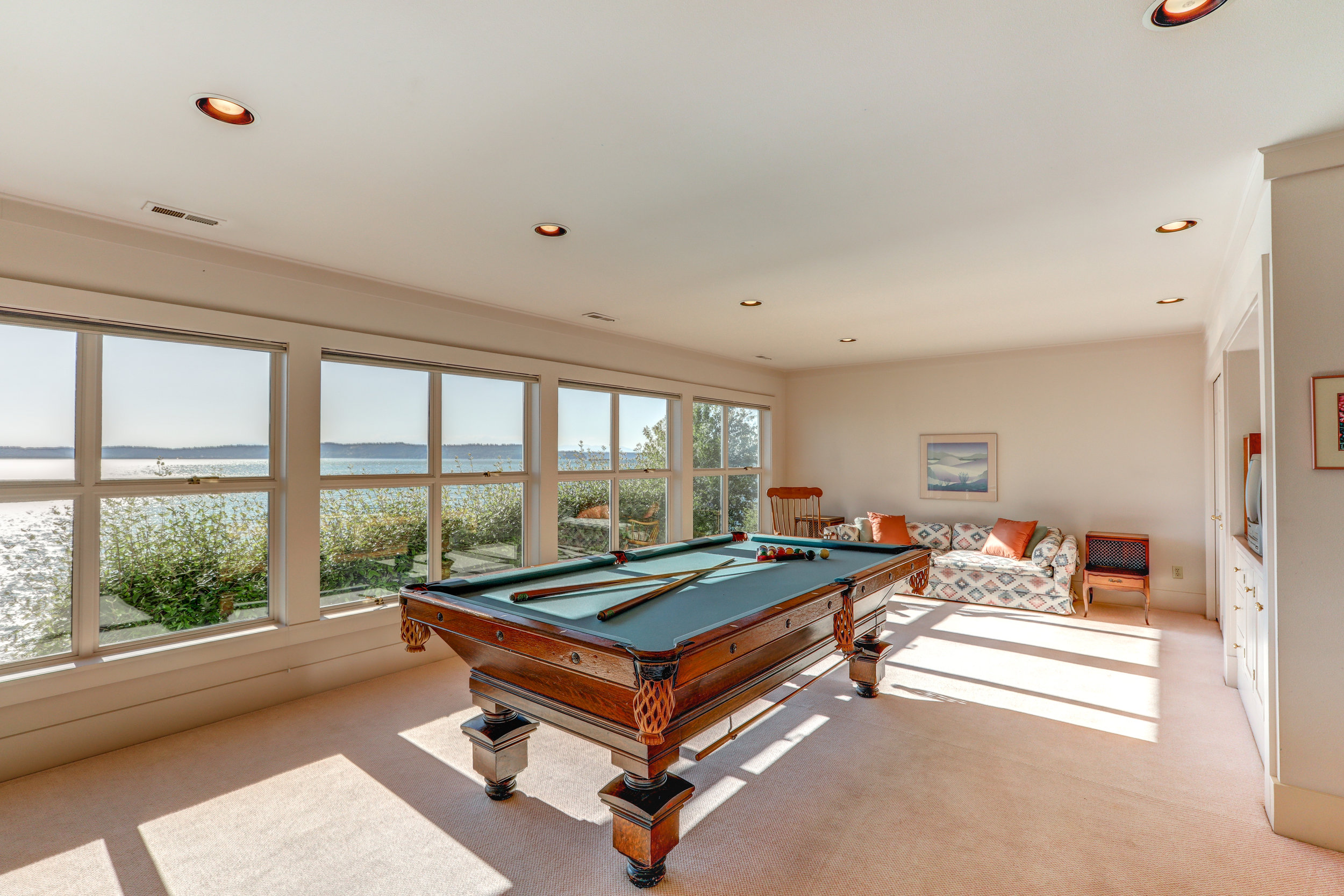
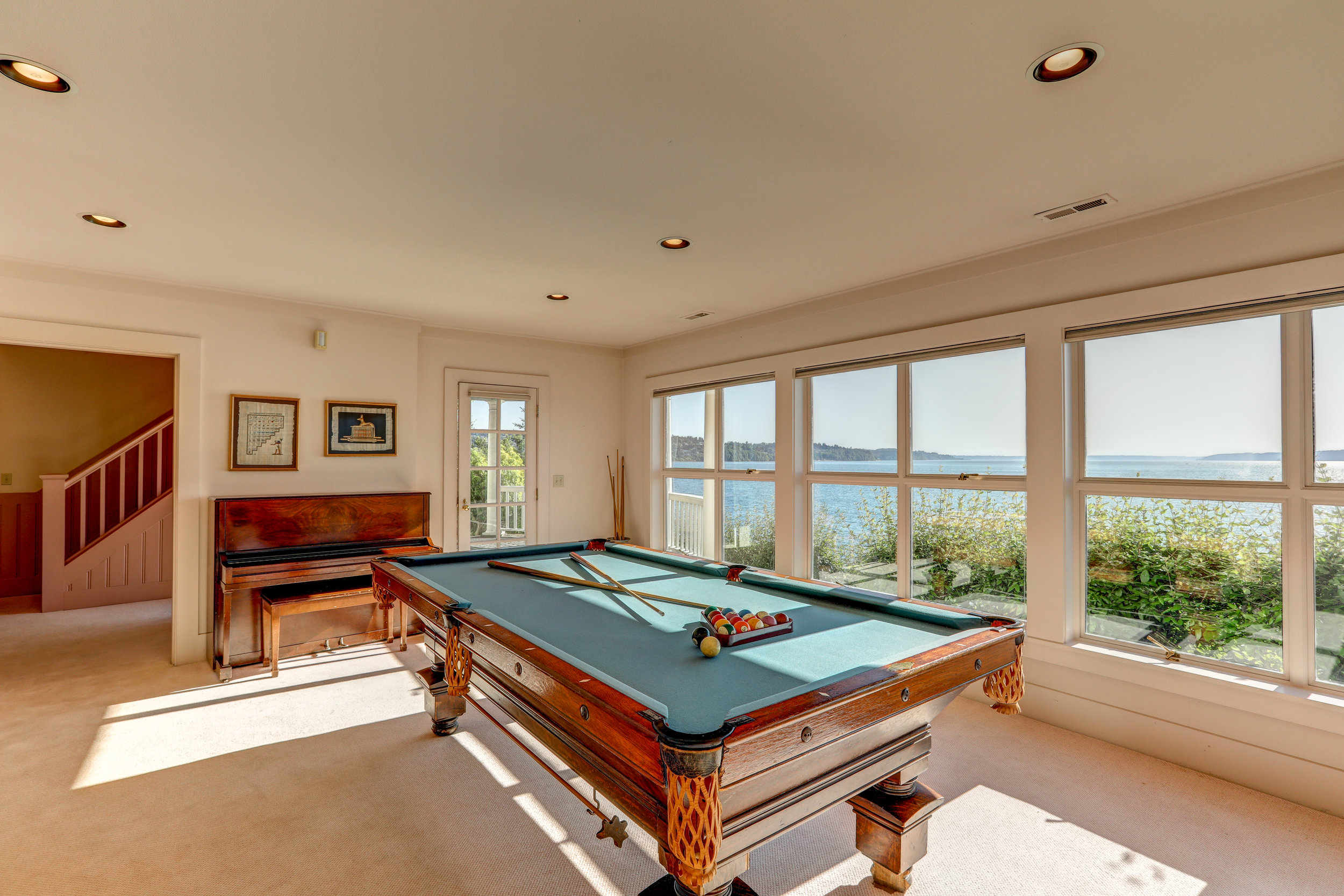
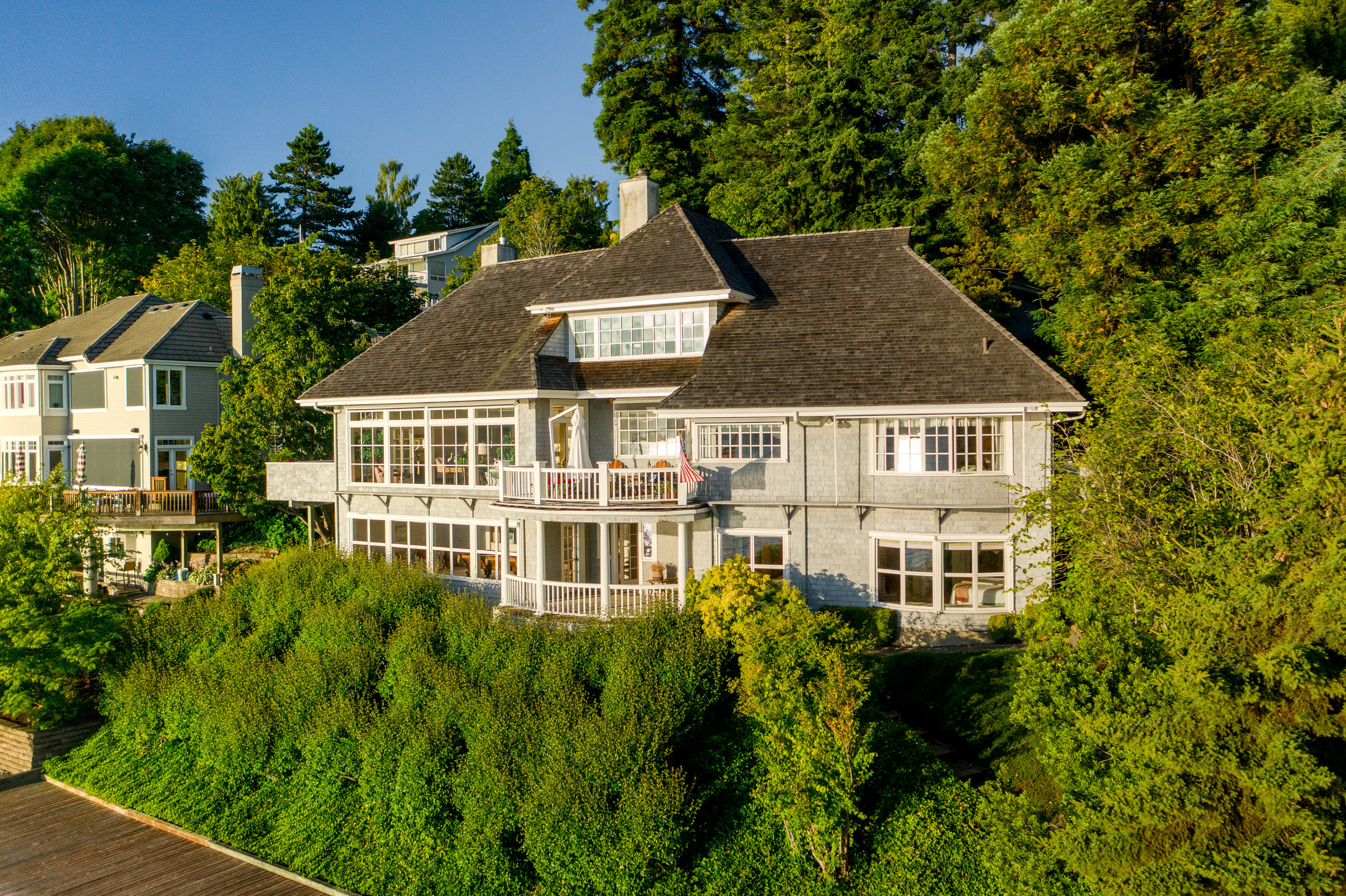
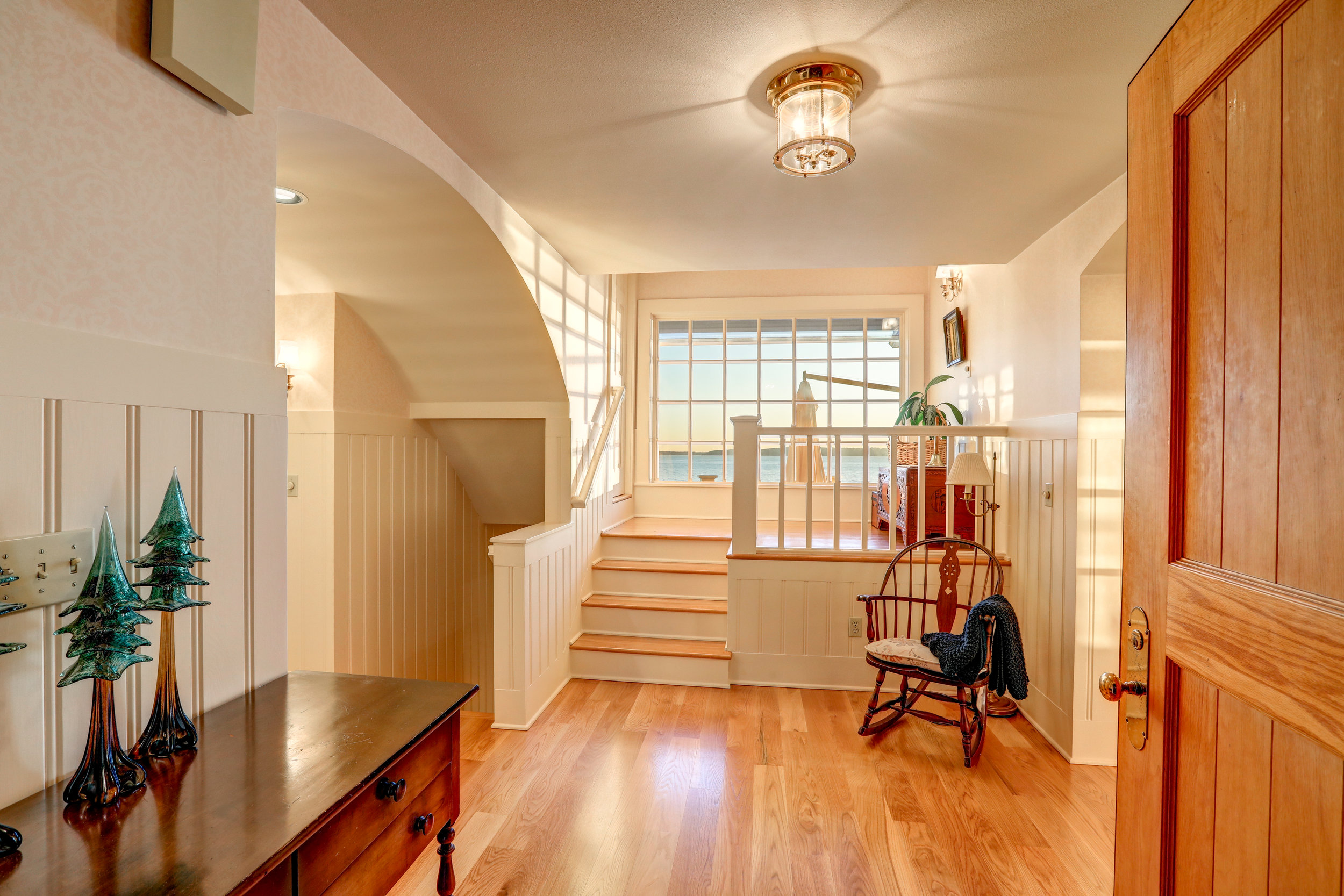
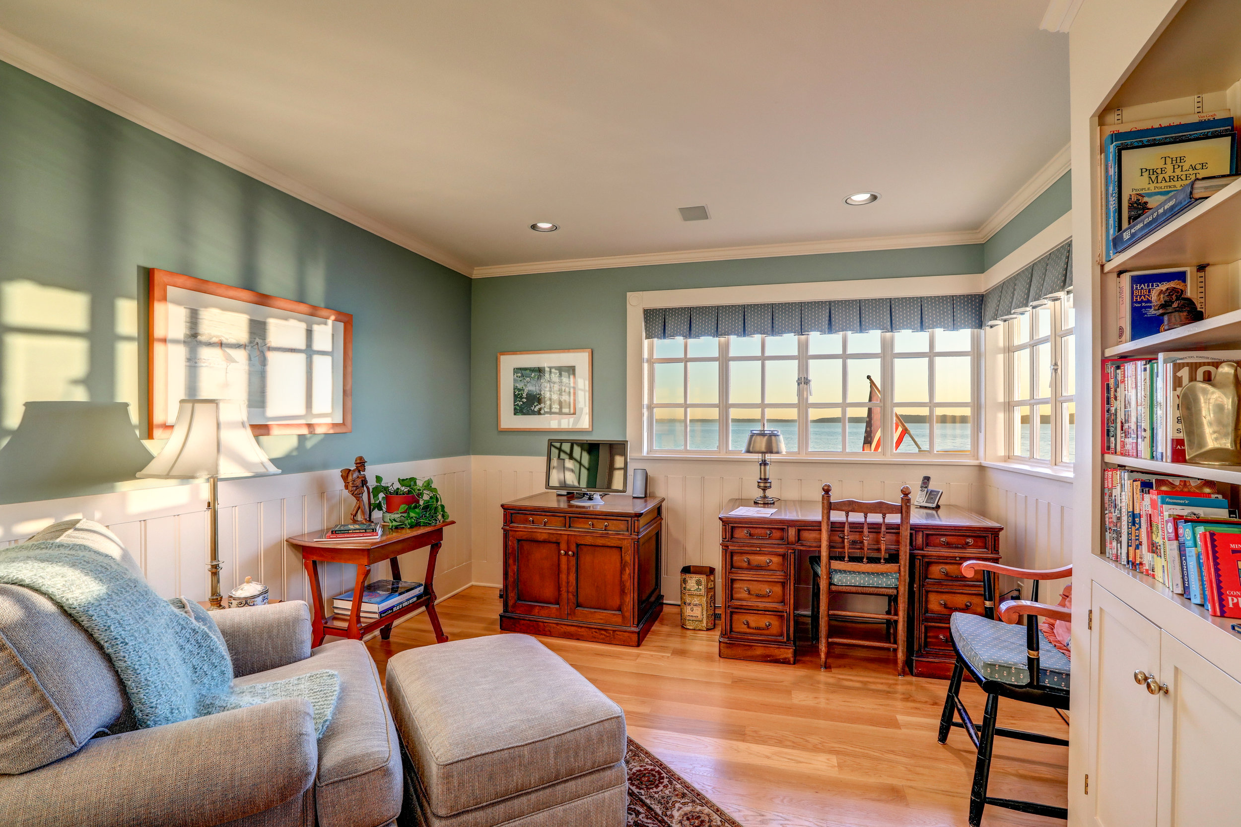
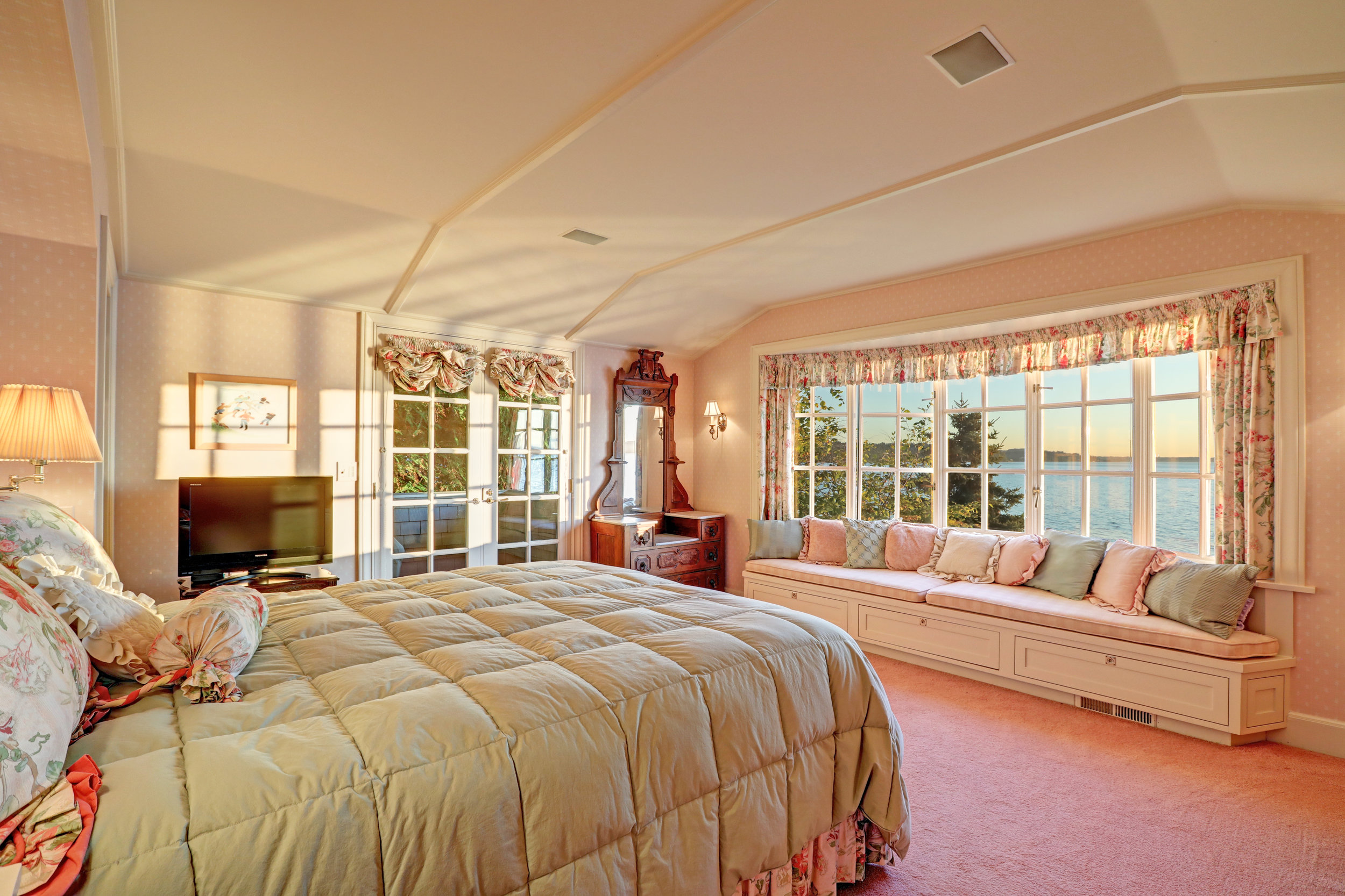
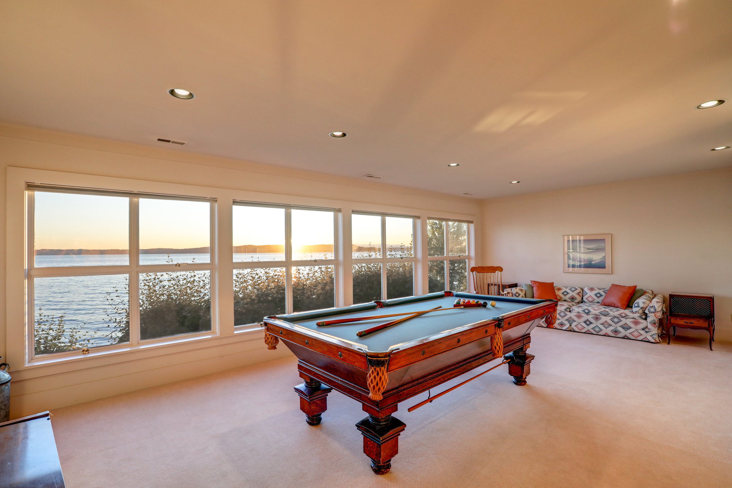
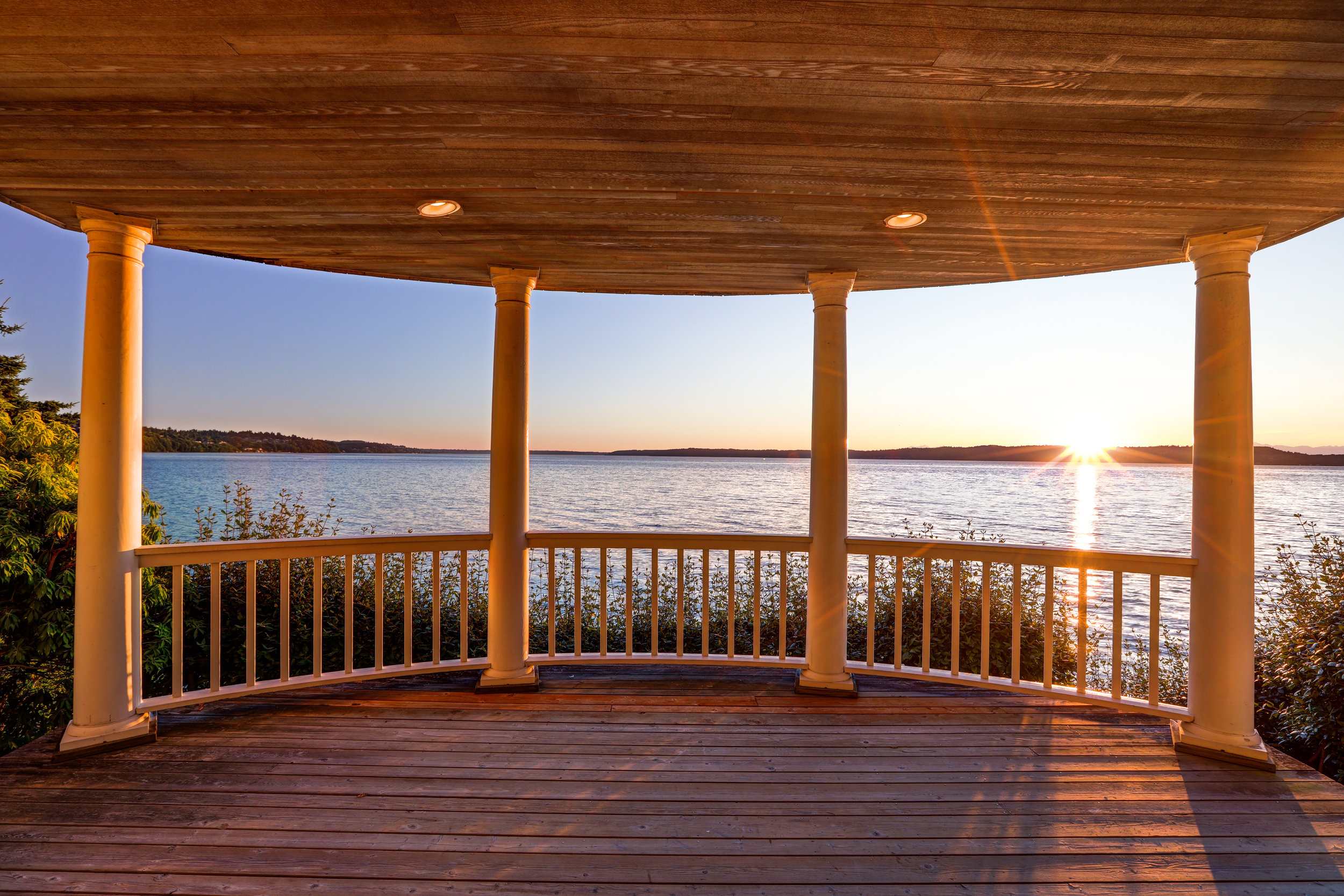
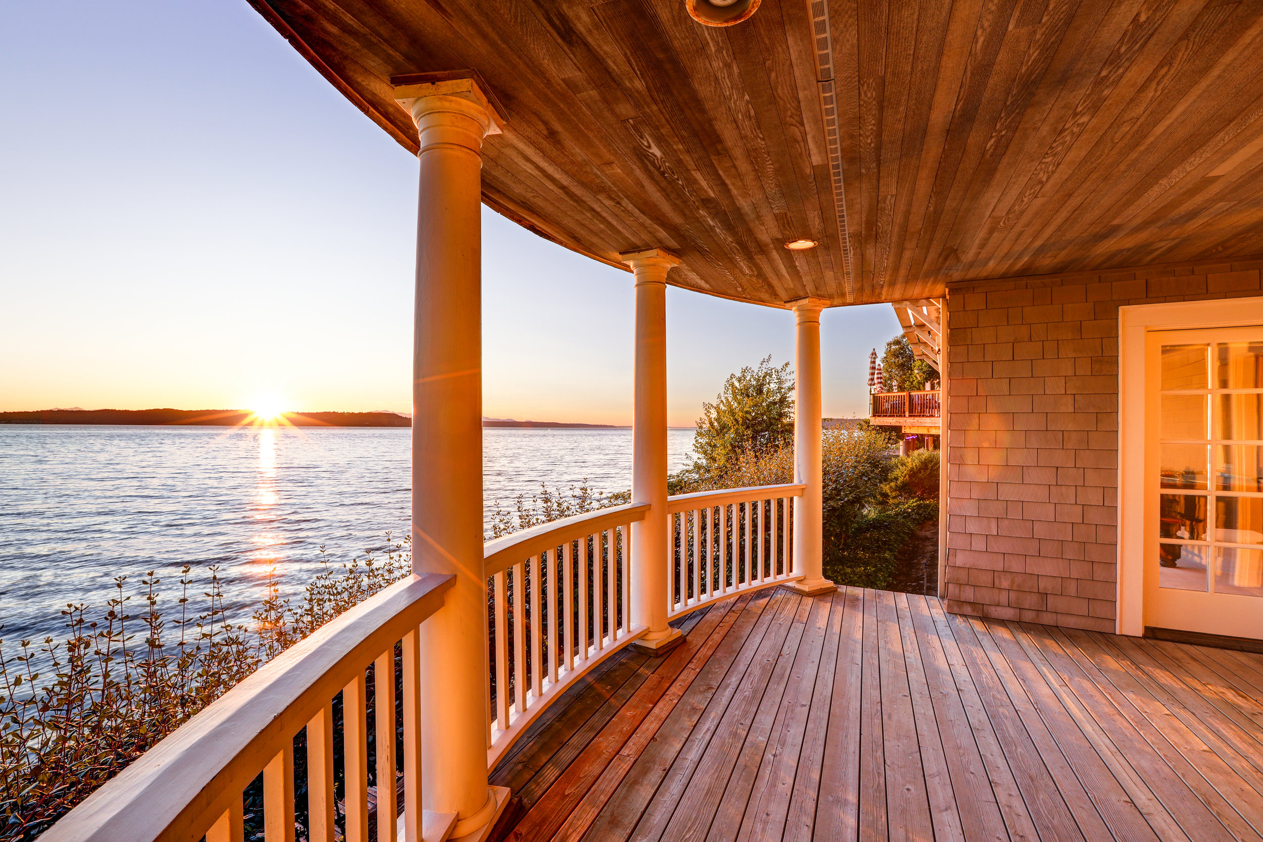
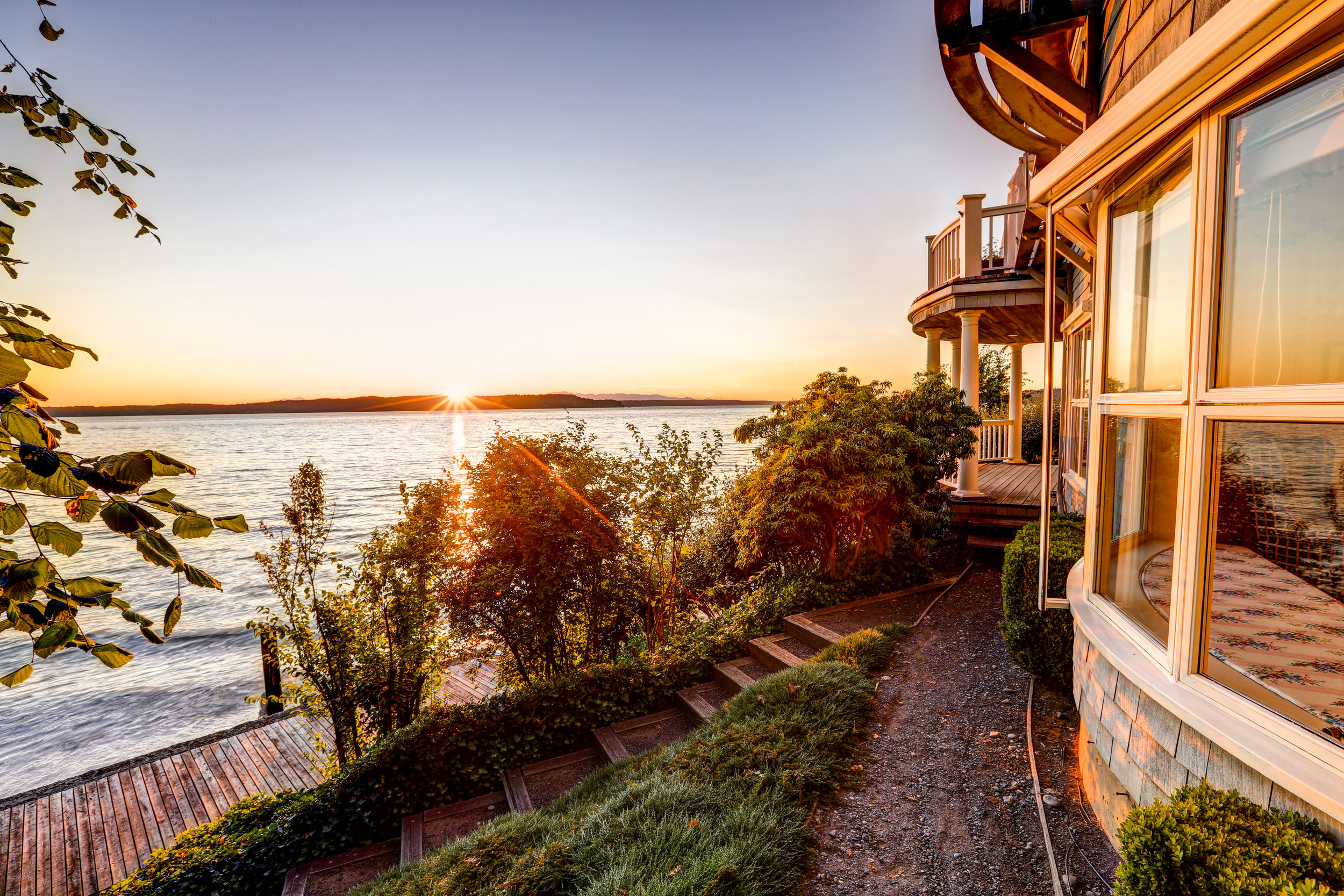
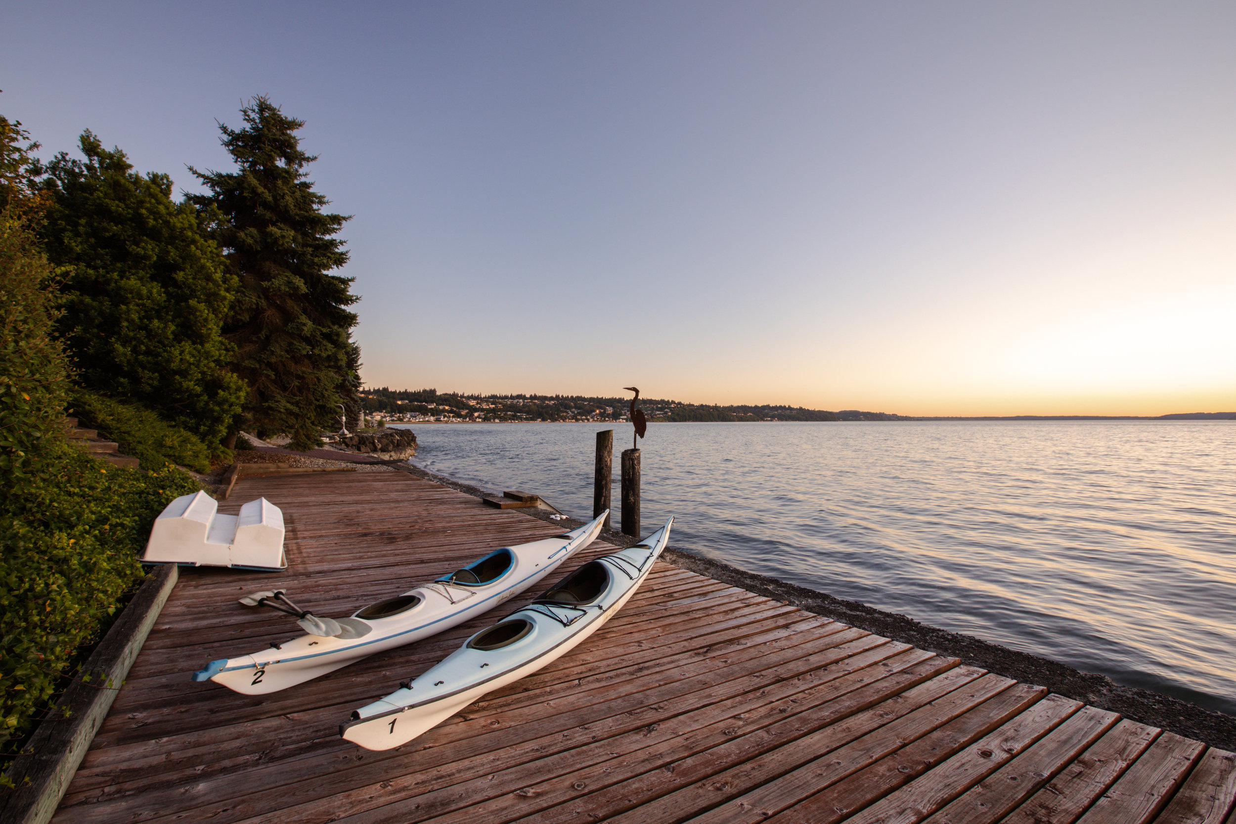
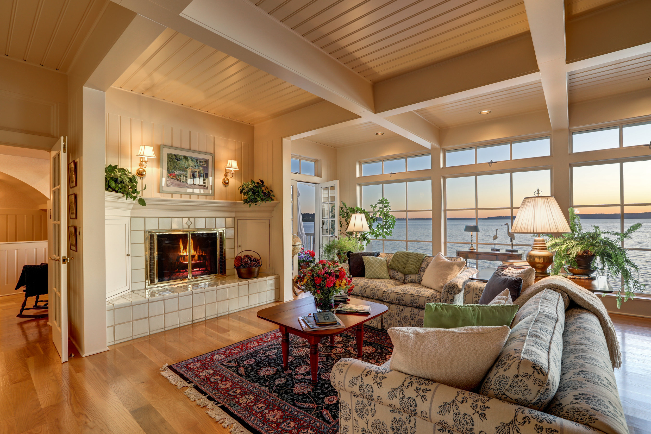
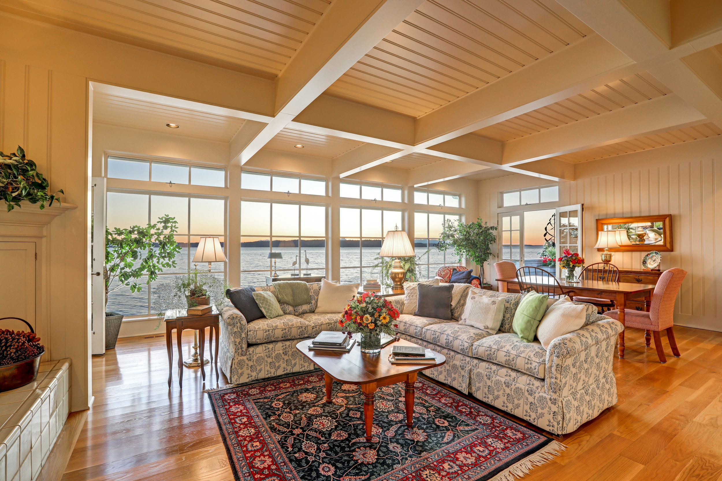
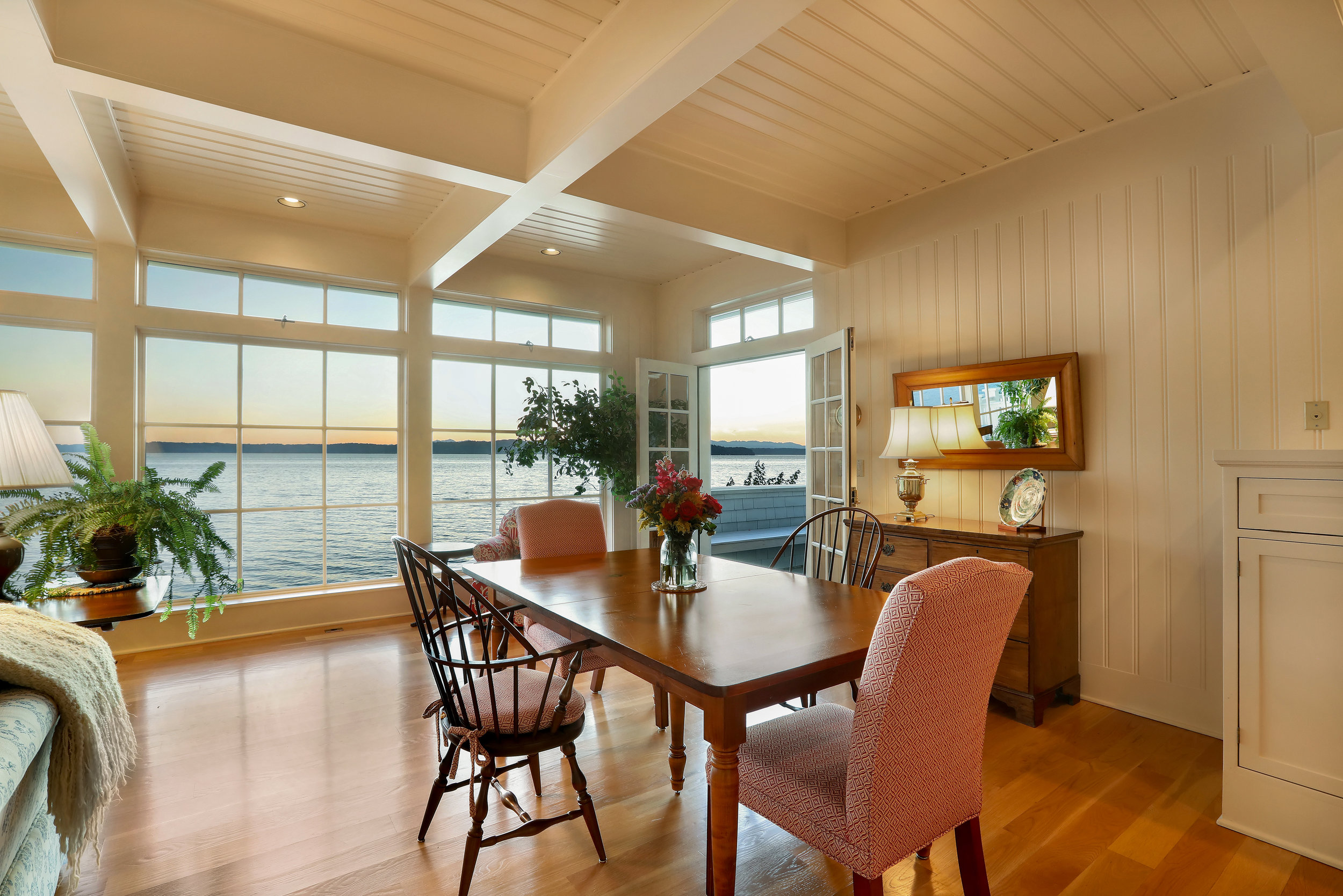
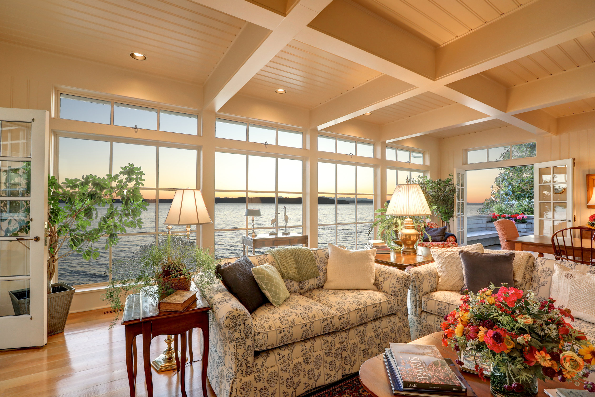
Had a last minute client who needed a website build and an email campaign to showcase her new listing! Waterfront is my personal favorite because the sunsets are just stunning! The Westwind at Woodmont Beach is curated to take in every single sunset.
Stunning vistas, gorgeous finishes and sand between your toes anytime you want. This was a last minute listing and we rushed to get it on the market, but we made it with grace and a sense of style. Big shout out to Lori DeVore, the real estate broker and listing agent, who put all the pieces together for me and gave me the space to design something gorgeous!
UNIQUE PROPERTIES | Farmhouse Gardens, Mount Vernon
Finished Brochure for Farmhouse Gardens in Mount Vernon, Washington | Sold at $1,550,000
This property is easily one of my favorites, mostly because I have a gardeners’ heart and you can find me in my garden more often than not and this property totally tugs on my heartstrings.
As with so many things, it all starts with a picture.
To begin, my client sent me a myriad of pictures to review and choose from. I settled in with pen-and-ink (just kidding, I type - what year is it?) to write about this stunning property, leading clients down the garden path and into their new home. I took the stunning photography and created beautiful writing, styled a logomark and created a unique look and feel for the property.
Inside, the brochure tells the story of the home in words and photos and then invites the potential buyer to imagine themselves in the home. Farmhouse Gardens was an absolute treat to be involved with.
“As a graphic designer, it’s my job to make your property look good; to find the story, the heartbeat of the property and then to showcase that heart to potential buyers.”
Custom Email Campaign
The Ampersand Logomark | Why "&" Matters
Why the Ampersand?
Photo courtesy of Max Anderson
According to Wikipedia (and why would the internet lie to a person?)
"The ampersand can be traced back to the 1st century A.D. and the Old Roman cursive, in which the letters E and T occasionally were written together to form a ligature. During the following development of the Latin script that led up to the Carolingian minuscule (9th century) the use of ligatures in general diminished. The et-ligature, however, continued to be used and gradually became more stylized and less revealing of its origin..."
...yeah, this is kind of where I stopped reading. Sorry, but I was tired. Essentially what it says is that the ampersand was created because of the inability to take the time to write out the E and the T as their own letters, so they were smooshed together and no one ever thought to change it back. So, laziness, in its own way, created an exceptionally beautiful graphic that I am madly in love with.
I also chose it as my logo mark because in the real estate industry there's always one more thing we can do to rock someone's entire world...so we start with branding. AND then we build a website featuring the home, with interior and exterior highlights...AND then we create a marketing campaign through emails, blogs and event....& it goes on. So many wonderfully creative ways to get heard in a media heavy world. AND we've only just begun.
Special Release | For Homes on the Market 40+ Days
Property Branding | Tied with a Bow
Life happens. Listings lag. Clients fall out and change their minds. Finances can get in the way of a clients' big dreams. Luckily, your listing can always get a fresh start.
Believe it or not we might - might - be easing into a buyers market during the busy season in real estate. According to Redfin, Seattle's overall housing inventory has doubled since May 2018. Meanwhile, home values have dropped by 4.5% since last year, according to Zillow, and they're projecting the fall to continue into the next year. This is creating a slow moving perfect storm for home buyers who’ve been considering a move.
All this means that real estate brokers are seeing more days on the market, and a slower home selling season. A quick review of the NWMLS shows more than a hundred homes in the area that have been on the market for more than a month.
Enter the Designer.
Special Release | 7.9.19
For Homes on the Market 40+ Days
So, here’s our special Sunshine Plan for homes that have been on the market for more than the 40+ days since spring began, homes that are ready for a little bit of love and a fresh perspective, all wrapped up…
…& tied with a bow.
Happy Solstice: Listing Presentations
The summer solstice always makes me pause and reorient myself, my life and my business.
Today I’ve been organizing some of my files and oogling my listing presentations over the last few years, and I’m enjoying how different they each are and how unique to each client. So many cool designs, so much good content and good heavens, my clients have the prettiest properties!
If you’ve been working in real estate for more than two minutes, you know that a listing presentation is one of the most influential pieces that you can showcase to your clients. It’s your resume, an example of your marketing prowess and a first impression all in one.
A listing presentation should be smart, savvy and expertly designed. You want to make a great first impression and then leave a little something behind for them to remember you by. It should be something that your potential seller can pick up later, something that they’ll want to read through again, something that intrigues them.
Most importantly, you want to show your potential seller that not only do you come with the backing of your brokerage, but with years of experience, excellent reviews, and a marketing plan that’s second to none! There’s no better way to rock that first impression!
Ready for a listing presentation that reflects all that you are as a realtor?
Karen Keefe: Waterfront & Windermere
Simple and elegant with an eye towards exceptional - words to describe both my client AND the awesome work we did for her! It begins, as most projects do, with nailing down the logo design! Our logo designer took this one and ran with it, creating a look and feel that matched Karen’s kind personality and bringing that to the forefront. The website works to highlight both her new brokerage and her clients new listings. We wanted to create a website that was easy to wander through and even easier to get lost on, showcasing a blog and her newest listings.
LOOK BOOK: Spring has Sprung
A Collection of Stunning Backyards & Outdoor Living Spaces
As the busy season starts to wind up there’s a rush to showcase gorgeous new listings, and since it’s my favorite time of year, and my favorite projects are always the ones that highlight pretty new properties. And if I get to showcase beautiful backyards while I dream of getting my own hammock out of storage, so much the better!
Italy, London & the Eastside
Marilisa Vergottini is a lovely broker with Marketplace Sotheby’s International Realty who has a passion for good staging, a smashing sense of style and a desire to help her clients find the home of their dreams. She finds her joy in the connection with her clients and she works to do more than just sell her listings - she wants everyone to know the story of the home.
Our team partnered with Marilisa and her innate style to create an elegant website, a Mediterranean look and feel for her logo and property pages that showcase the high-end photography that she uses to tell her stories. She also brought us some of the most gorgeous homes to play with! This project was so much fun and we got to be so creative throughout!
One Bourbon, One Scotch and One Website
We started with a cup of coffee, as all good conversations do; walked through what he needed his website to do, what his next steps were with his marketing and what he loved most about real estate.
We scheduled a time to do a photoshoot – which was a kick! Matt has smashing taste and style, and it came across on camera so beautifully!
Matt started collecting high res photos and collateral for me and I reached out to one of my favorite logo designers. She took one look at Matt’s photos and said “Vogue. All the way.” And headed off to design a logo that felt like high-end fashion.
This was my first time working with an individual brokers’ IDX so I had a lot to learn and there were a few late nights with a glass of happiness. Thank heavens for youtube and a couple of stupid talented web developers who also speak designer and have a metric ton of patience. (Though I’m pretty sure by the time they were done with me, they’re giving up their jobs to become roofers. Maybe they’ll let me design their website…hmmmm.)
This project challenged my knowledge base, encouraged creativity and pushed our team to create an incredible website that collects leads, offers easy IDX searches and showcases his sales successes and his testimonials in a clear and creative way. We included all the bells and whistles on the site but managed to keep it clean and elegant. Matt loved it and I’m beyond thrilled to add this to my portfolio! Big shout out to an amazing client and an incredible team who made this website shine.
PHOTOGRAPHY | Sheri Putzke
“Kodachrome
They give us those nice bright colors
They give us the greens of summers
Makes you think all the world's a sunny day…”
-Paul Simon
There’s something magical that happens when you take someone’s photo, when that person sees - for just a moment - the way that you see them. Not only is Sheri Putzke of Windermere a complete treat to work with in real life, she’s amazing to take photos of. Stunning in her own right, with a sense of style that shows across everything she touches, Sheri’s smile starts in her eyes and she played to the camera flawlessly. And we can talk about pearls and pink? I was swooning before I even turned on my camera.
Logo Design
There’s something magical about logo design. I don’t do it as often as I’d like, and it’s easily one of the most challenging projects that I take on. It’s like creating a version of someone’s heart while driving clients to grow their business and oh, yeah - it should look cool. Piece of cake.
My job is to make you look good. But it’s also my job to understand your business and your clientele well enough to fill in the blanks where the heart of your idea bumps up against the needs of your business.
All of that being said, it’s quite rare that my favorite logos make the cut, and I wanted to share some of my personal favorites with you. Please remember, these are just my drafts, but they were too much fun to leave behind.
Final Logo, Approved
Marilisa Vergottini of Marketplace Sotheby’s International Realty needed a logo that was glamorous and classy and she wanted something with a Mediterranean flair. Luckily, my toolbox includes the lovely and talented Sarah Alston who is an incredible designer; she worked tirelessly to create a series of drafts for her to review and we were able to create a balanced and classic logo for her new brand.
Final Logo, Approved
Nancy Klinck is a Seattle broker with Realogics Sotheby’s International Realty, and I had the privilege of designing her logo, branding and website along with multiple properties websites as well. She needed a logo that was elegant and classy, without being pretentious. The end result feels wonderfully “My Girl Friday” but with a certain Cary Grant-esque stability about it.
Final Logo, Approved.
Okay, don’t judge me…I love the door in the logomark. I just love it so much I squeed outloud when I designed it. But, just because I think it’s fabulous doesn’t mean that my client will love it. Nine times out of ten, the one that I absolutely love gets set aside for a better connection to a logo that speaks to the clients’ heart.
RE/MAX Northwest
RE/MAX Northwest
Work Hard. Be Nice.
RE/MAX Northwest is the largest RE/MAX in Washington State and they are still growing. They needed a website that was dynamic and engaging, but also useful. So, it needed to be pretty, but they also needed to be able to showcase properties, build out a Market Report and blogs, and showcase their current and new brokers.
It started with their tagline: Work Hard. Be Nice. We wanted to capture the kindness and values of the people that work there, embrace the largeness of the company and welcoming to potential brokers. Wordsmithing is always important; the owners had done an incredible job of putting these values into words, which made my job much easier, and helped me understand what they needed to showcase. We made recommendations on the direction for the site, but they gave our team a lot of freedom to be creative.
Each of the ten locations is highlighted individually, with custom coded IDX feeds for each location, highlighted properties and beautiful images. Custom map design, market report design and tons of research went into this project, and the clients were thrilled with how it turned out!
Pantone's Color of the Year | Living Coral
PANTONE 16-1546 Living Coral
According to Pantone: “Vibrant, yet mellow PANTONE 16-1546 Living Coral embraces us with warmth and nourishment to provide comfort and buoyancy in our continually shifting environment.”
All I can think when I see this is color is my best friends dumb little antique chair that she painted this wonderful, shocking color that matches nothing in her home so it sits on the porch.
My best friend’s husband Sam pictured on the chair, his true love, Luna on his lap and guard dog, Xollin.
It’s wonderful, bright, cheery and ridiculous. Pair it with blues and it feels like a beach house. Pair it with grays and it becomes elegant.
Pantone’s goal was to create an authentic color that is both sociable and spirited that symbolizes our innate need for optimism and playful expression. Mission accomplished.
And speaking of coral…
Dr. David Vaughan is a marine biologist who works specifically with coral reefs. Due to an actual “oops” in science, he found out that while the coral reefs are still in danger, he could speed up the growth of the reefs by - get this - breaking them. Just a “happy little accident,” as Bob Ross likes to say. But this happy accident is going to change, and possibly save, our oceans.
BlinkNow | Holiday Giving
This year I am hoping to raise $500 to send to help the Kopila Valley women and children and I need your help! Every little bit counts, and every penny helps!
From the very beginning of their story, they built this community together. Every red brick, every hot breakfast, and every amazing breakthrough – all made possible by dedicated people like us. There are many ways to get involved, create something, and build a brighter future for the children and women of Kopila Valley.
There are so many needs in this world, and this young woman gave everything she had and then she gave more. And with gratefulness. There’s no chance that in this life I will be able to be this brave, but I am honored to help her in every way that I can.
Small Business Saturday #shopsmall
I can’t say it loud enough: support small business this year! It’s the backbone of our economy, your gifts are made with love and you’re supporting your next door neighbor! Happy Shopping!


