Please ensure Javascript is enabled for purposes of website accessibility

logo design

Web Design for McRae Homes

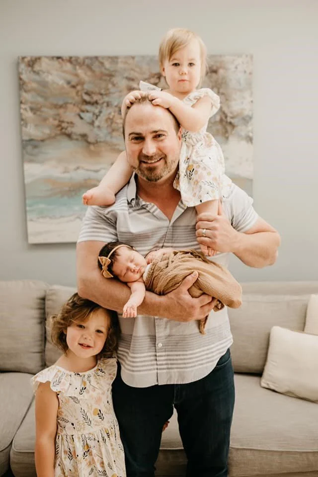
Mike and the Kidlets.jpg

I know I say this a lot, but I really do have the most amazing clients. From the the word “go” this sweet family was working around a baby who wanted to come early, building a new home, two little girls needing step one of education and a world pandemic.

Mike and the Kidlets

Mike and the Kidlets

Mike treats all his clients as if they are family. After all, it’s their money, their time, and their livelihood that he’s dealing with. He’s available around the clock and does whatever it takes to get the job done. Mike is the type of broker that will put on his work boots and head lamp to go in the crawl space for you, even if it’s littered with mice. He’s a unique breed of real estate agent and he’s a talented general contractor to boot.

This created an especially unique stack of challenges; creating an online vision that showcases Mike’s working style, highlights his extensive skill set and connecting it all with his talent in real estate as well. His wife Nicole is his marketing manager, house and business manager and an incredibly talented writer.

We started with a logo design that was clean and fresh with a strong and elegant bent. Working in strictly black and white, focusing on a design that was elegant enough to sell million dollar homes, but strong enough that no one would be surprised when Mike hops up on the roof to check out the gutters.

Nicole partnered closely with me to create a website that was a useful space for their clients, offering a myriad of data in a clean, friendly way. From general contracting to painting to finding a home buyer for their new listing to connecting home sellers to buyers that fall in love with their home or property, the McRae Homes website is curated to showcase their mad skill set.

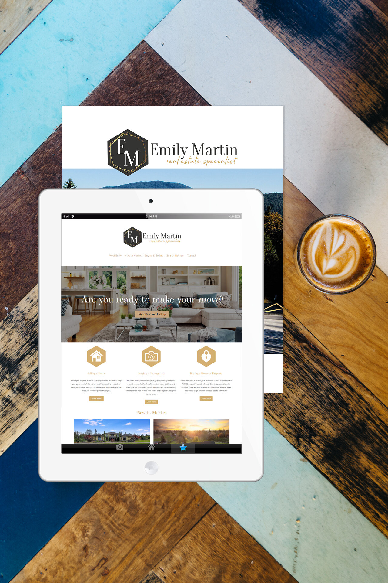
Web Design & Branding for Emily Martin Homes

Emily Martin has a passion for her clients, a love of the Pacific Northwest, and a talent for connecting new construction homes to their new owners. Working with Emily was an absolute treat! We started with a logo design that was clean and fresh with a modern bent and a classic style. Working with deep grays and a custom gold, Emily Martin’s logo design creates an elegance that highlights her experience with luxury homes while feeling cozy and inviting in its simplicity.

She partnered closely with me to create a website that was a useful space for her clients, offering a myriad of data in a clean, fresh way. From home staging to finding a home buyer for her new listing to connecting home sellers to buyers that fall in love with the home or property, Emily’s website is curated to clients’ needs. Looking forward to many more projects with Emily!

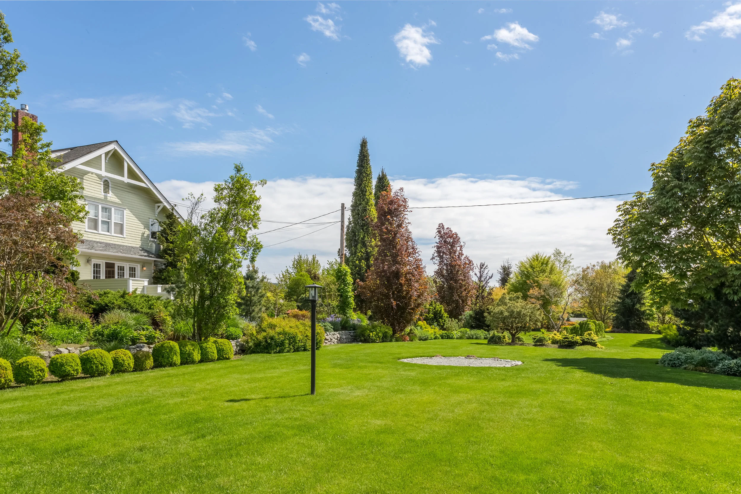
UNIQUE PROPERTIES | Farmhouse Gardens, Mount Vernon

Finished Brochure for Farmhouse Gardens in Mount Vernon, Washington | Sold at $1,550,000

Finished Brochure for Farmhouse Gardens in Mount Vernon, Washington | Sold at $1,550,000

This property is easily one of my favorites, mostly because I have a gardeners’ heart and you can find me in my garden more often than not and this property totally tugs on my heartstrings.

As with so many things, it all starts with a picture.

To begin, my client sent me a myriad of pictures to review and choose from. I settled in with pen-and-ink (just kidding, I type - what year is it?) to write about this stunning property, leading clients down the garden path and into their new home. I took the stunning photography and created beautiful writing, styled a logomark and created a unique look and feel for the property.

Inside, the brochure tells the story of the home in words and photos and then invites the potential buyer to imagine themselves in the home. Farmhouse Gardens was an absolute treat to be involved with.

As a graphic designer, it’s my job to make your property look good; to find the story, the heartbeat of the property and then to showcase that heart to potential buyers.
— Jesse Gibbs
Custom Email Campaign

Custom Email Campaign


Special Release | For Homes on the Market 40+ Days

Property Branding | Tied with a Bow

Life happens. Listings lag. Clients fall out and change their minds. Finances can get in the way of a clients' big dreams. Luckily, your listing can always get a fresh start.

coffee cup wood table dark for Olga.jpg

Believe it or not we might - might - be easing into a buyers market during the busy season in real estate. According to Redfin, Seattle's overall housing inventory has doubled since May 2018. Meanwhile, home values have dropped by 4.5% since last year, according to Zillow, and they're projecting the fall to continue into the next year. This is creating a slow moving perfect storm for home buyers who’ve been considering a move.

All this means that real estate brokers are seeing more days on the market, and a slower home selling season. A quick review of the NWMLS shows more than a hundred homes in the area that have been on the market for more than a month.


Enter the Designer.


Special Release | 7.9.19

For Homes on the Market 40+ Days

So, here’s our special Sunshine Plan for homes that have been on the market for more than the 40+ days since spring began, homes that are ready for a little bit of love and a fresh perspective, all wrapped up…

escala 2005 collateral ribbon.jpg

…& tied with a bow.

Brand New // New Brand

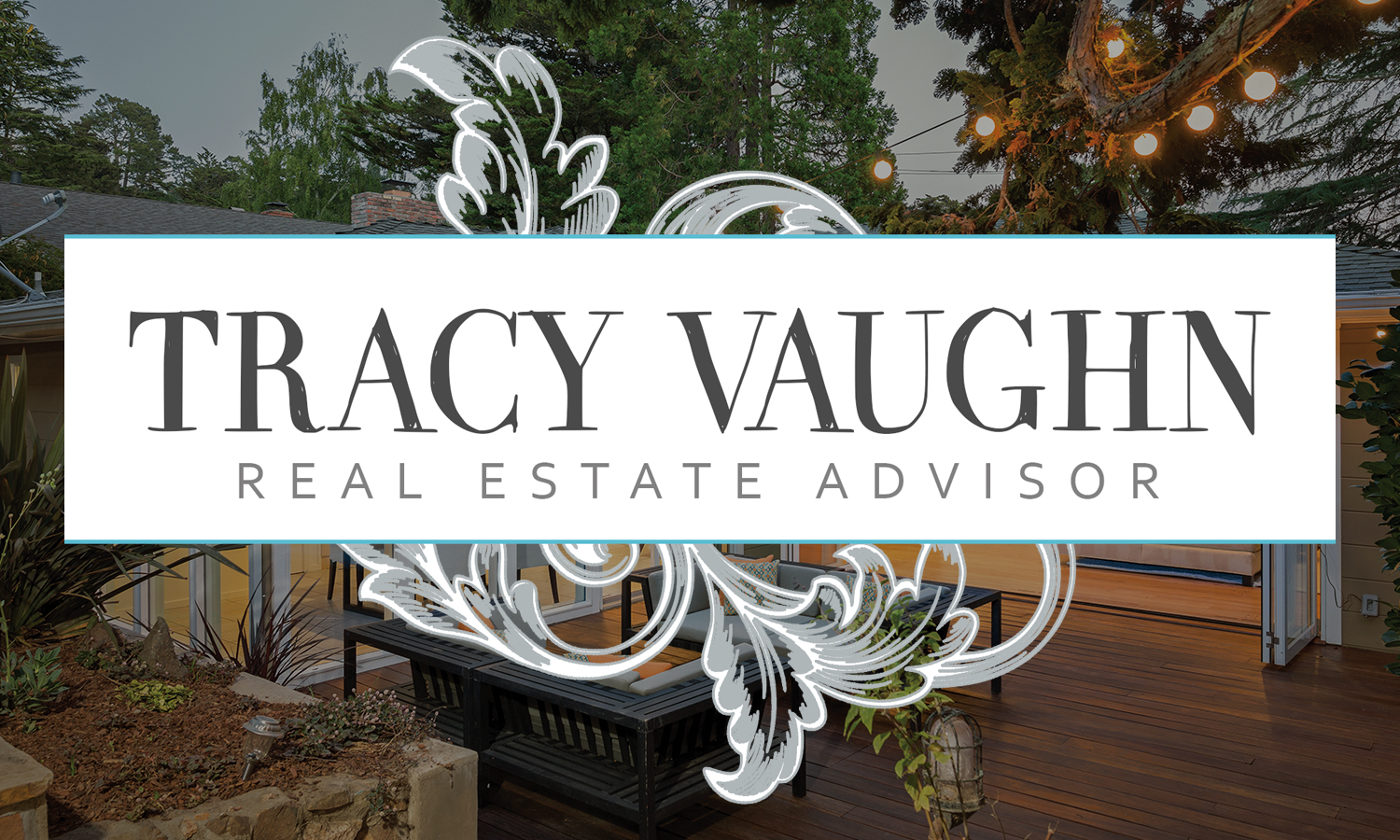
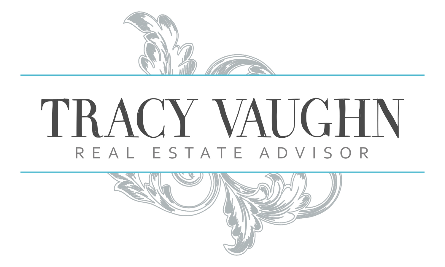
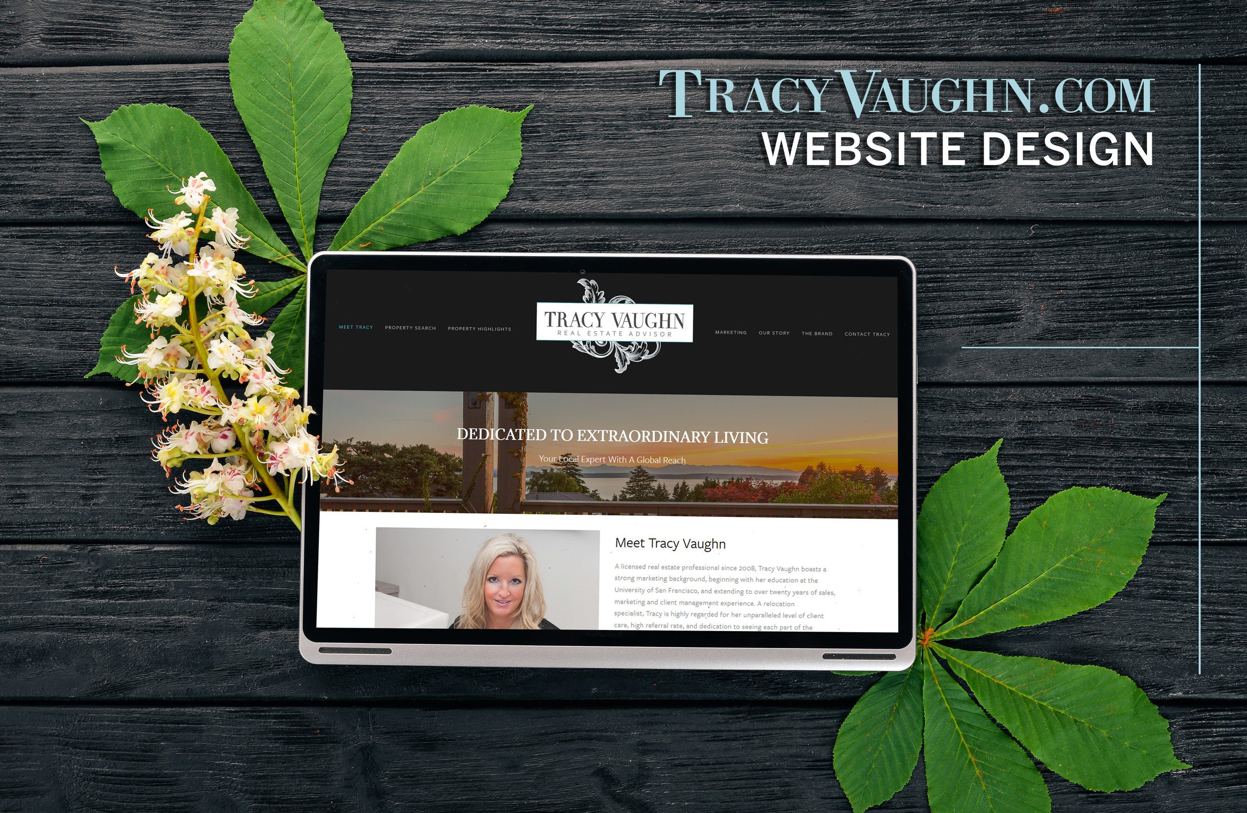
Tracy Vaughn and I have worked together for so long that we’re actually rebranding on my own design! This is a great place to be - watching my clients grow both themselves and their businesses! Tracy is an exceptionally hardworking broker; she’s passionate, fiercely feminine, artistic and funny and we wanted to create something that felt more like who she is. The new branding had to feel like a “step up” in terms of style, while not losing the aspects of her previous logo that she loved for so long.
Don’t Dull My Sparkle

After a fun-filled trip to visit my extended family in North Carolina and Virginia, I came down with the plague and lost all energy for almost ten days, and the bulk of my creativity as well. Being creative on demand is a skill that takes time to develop, but when you’re out, you’re out.

I reached into my wonderful toolbag for my favorite logo designer, Sarah Alston, who just happened to be available for a two day Design Jam with me. The homes that Tracy is hoping to focus on listing are in Sarah’s old backyard; it was a match made in heaven. “Just design something that makes you want to list a house with this amazing agent. Go.”

The Drawing Board

Okay, I can almost hear my favorite prof telling me that “you have to do the process” and all the other brilliant things she would say anytime I tried to take a shortcut. You have to do a thousand sketches, throw them away and start fresh. Since Sarah’s been helping me with logo design, she’s been reminding me of a lot of my basics and we’ve been revamping the way I offer deliverables to my clients.
For Tracy, it was important for me to create a mood board with her because 1) I wanted her to see herself in this new light, and 2) it helped me hone in on her goals and needs for her the direction of her business.

On a side note: I may have sparkled all over myself with monogram this design. *swoon

Making a Match

I know that I say this often, but this really is one of my favorite things about my job; The Refresh. Watching the look and feel begin with an idea, a touch of color and few magic sprinkles and spreading into new high-end brochures, an updated website style, email designs - each piece adding to the value of her brand. Special thanks to Sarah Alston for the awesome logo design and to Tracy for being the kind of creative person that is a joy to play with.


There’s always an “&”

And. we’re already sold and on to showcase this incredible sale in only three days to the rest of the neighborhood! Congratulations to my client and her clients, too!

Tracy Vaughn Branding Postcard Pending.jpg