Please ensure Javascript is enabled for purposes of website accessibility

marketplace sotheby's international realty

Web Design for McRae Homes

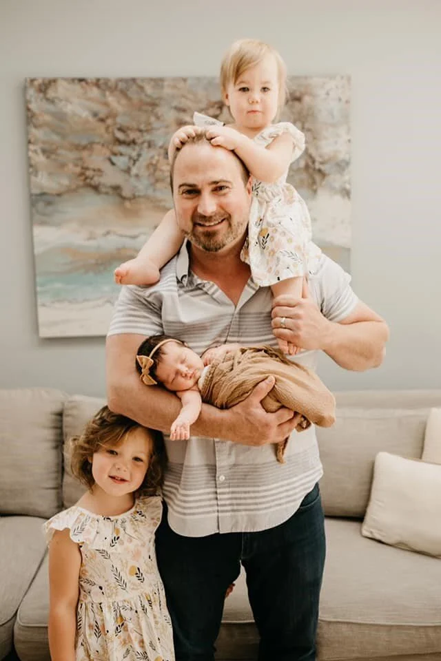
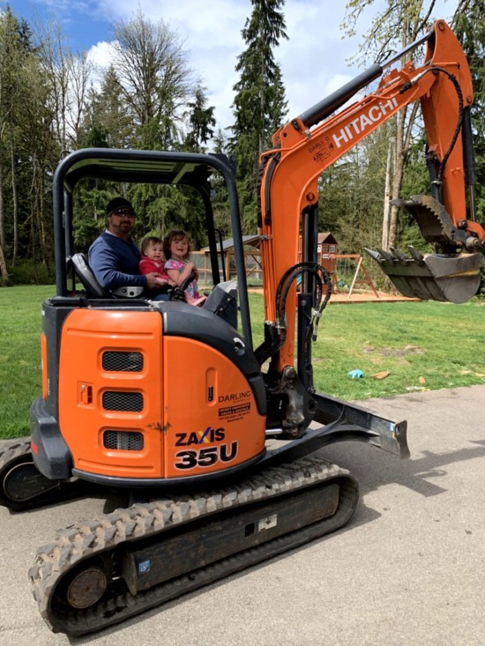
Mike and the Kidlets.jpg

I know I say this a lot, but I really do have the most amazing clients. From the the word “go” this sweet family was working around a baby who wanted to come early, building a new home, two little girls needing step one of education and a world pandemic.

Mike and the Kidlets

Mike and the Kidlets

Mike treats all his clients as if they are family. After all, it’s their money, their time, and their livelihood that he’s dealing with. He’s available around the clock and does whatever it takes to get the job done. Mike is the type of broker that will put on his work boots and head lamp to go in the crawl space for you, even if it’s littered with mice. He’s a unique breed of real estate agent and he’s a talented general contractor to boot.

This created an especially unique stack of challenges; creating an online vision that showcases Mike’s working style, highlights his extensive skill set and connecting it all with his talent in real estate as well. His wife Nicole is his marketing manager, house and business manager and an incredibly talented writer.

We started with a logo design that was clean and fresh with a strong and elegant bent. Working in strictly black and white, focusing on a design that was elegant enough to sell million dollar homes, but strong enough that no one would be surprised when Mike hops up on the roof to check out the gutters.

Nicole partnered closely with me to create a website that was a useful space for their clients, offering a myriad of data in a clean, friendly way. From general contracting to painting to finding a home buyer for their new listing to connecting home sellers to buyers that fall in love with their home or property, the McRae Homes website is curated to showcase their mad skill set.

TBT: Matt Hart Homes - Brochures & Branding

Few things make me as happy as design projects with beautiful homes, and Matt Hart’s team has a lot of gorgeous properties. We started an elegant and simple logo design and then we got to work on a trifold for his team.

Matt works north of Seattle, specializing in the Woodinville and Bothel areas, with a love for helping his clients find unique homes around the Puget Sound. The goal of the design was to create a clean, modern logomark that could stand on its own and partner with Marketplace Sotheby’s.

Once his logomark was set we got started on a trifold that he would use to highlight his past sales, current listings and showcasing what his team had to offer potential new clients. Used as a mailer and a collateral piece at listings, this brochure is one of my favorite pieces because it matched so beautifully with the homes that he sells and who he is as a luxury real estate broker.

Matt Hart Trifold Brochure.jpg

No Time Like the Present: Building Your Marketing Collateral

Marilisa Vergottini’s Custom Website | Marketplace Sotheby’s Int’l Realty, 2019

Marilisa Vergottini’s Custom Website | Marketplace Sotheby’s Int’l Realty, 2019

Many people in the Seattle area are feeling a bit of a slow down with the current health issues we’re dealing with. Local real estate agents are feeling the pinch, though I do have several that are just rocking it right now, leaning into a potential buyer’s market. If you find that you’re stuck at home - whether by choice or circumstance - now is the time to update your marketing materials, get in front of any collateral projects that are outstanding, create a custom brand and even a stunning website.

What projects have you been putting off?

Matt Martel’s Custom Website | RE/MAX Northwest, 2019

Matt Martel’s Custom Website | RE/MAX Northwest, 2019

Barry Long’s Custom Logo/Branding, Website, Brochures | Marketplace Sotheby’s Int’l Realty, 2019

Barry Long’s Custom Logo/Branding, Website, Brochures | Marketplace Sotheby’s Int’l Realty, 2019

ABLE Environments | ACCESSIBILITY. LUXURY. UNIVERSAL DESIGN.

Real Estate Brokers, Barry Long and Tom Minty, believe that everyone should have the opportunity to find a home that fits their needs.

I am so freaking proud to be able to play the designer to their brilliant business plan. In 2017, Tom Minty and Barry Long joined the marketing power and resources of their brokerages and life experiences to create a truly unique real estate partnership that is ABLE Environments. Through this partnership, Tom and Barry strive to meet their client’s demands for accessible housing now and in the future, for our aging population, and people of all abilities.

The initial step in making their vision a reality, was the creation and launch of searchable criteria for accessibility home features, with a prominent display in the Multiple Northwest Listing Service, the first of its kind in the nation.

Building on this direct knowledge and momentum, ABLE Environments is dedicated to being the resource for buying, selling, and marketing homes that fit their client’s specific needs, with benefits for everyone. Whether you’re looking to buy, build, remodel, or renovate, ABLE Environments has the inventory of homes, networks, and partnerships throughout the real estate industry to find the right solution for you.

JUST RELEASED: BarryLongHomes.com

So, for starters, Barry Long is one of the most badass real estate agents I’ve ever worked with. He’s wildly creative, hard working and really understands his clients. Barry Long and Rod Moore have been working with the MLS to change the rules of engagement a bit, and they’ve been wildly successful. They have effectively implemented changes in the Northwest MLS making us the first state in the country with a comprehensive set of accessibility options for agents to use when listing and buying homes with accessibility features.

Barry proudly offers his clients a one-of-a-kind experience that includes the distinct capability to find and market Accessible, Age-in-Place, and Universal Design properties. Whether you have existing accessibility features or want to find an accessible or adaptable home, Barry knows the right questions to ask and will work closely with you; utilizing years of first-hand experience and a strong social network to get you where you need to be.

Every step of the way this project was a blast. Looking forward to the next marketing collateral that Barry Long Homes brings to the table! <3

Logo Design

There’s something magical about logo design. I don’t do it as often as I’d like, and it’s easily one of the most challenging projects that I take on. It’s like creating a version of someone’s heart while driving clients to grow their business and oh, yeah - it should look cool. Piece of cake.

My job is to make you look good. But it’s also my job to understand your business and your clientele well enough to fill in the blanks where the heart of your idea bumps up against the needs of your business.

All of that being said, it’s quite rare that my favorite logos make the cut, and I wanted to share some of my personal favorites with you. Please remember, these are just my drafts, but they were too much fun to leave behind.

Final Logo, Approved

Final Logo, Approved

Marilisa Vergottini of Marketplace Sotheby’s International Realty needed a logo that was glamorous and classy and she wanted something with a Mediterranean flair. Luckily, my toolbox includes the lovely and talented Sarah Alston who is an incredible designer; she worked tirelessly to create a series of drafts for her to review and we were able to create a balanced and classic logo for her new brand.

Final Logo, Approved

Nancy Klinck is a Seattle broker with Realogics Sotheby’s International Realty, and I had the privilege of designing her logo, branding and website along with multiple properties websites as well. She needed a logo that was elegant and classy, without being pretentious. The end result feels wonderfully “My Girl Friday” but with a certain Cary Grant-esque stability about it.

Final Logo, Approved.

Final Logo, Approved.

Okay, don’t judge me…I love the door in the logomark. I just love it so much I squeed outloud when I designed it. But, just because I think it’s fabulous doesn’t mean that my client will love it. Nine times out of ten, the one that I absolutely love gets set aside for a better connection to a logo that speaks to the clients’ heart.