I designed the website for RE/MAX Northwest here in Washington and as part of my research I came across Lauren’s old website and immediately fangirled her; it was clear that she understands good photography, she’s an excellent writer and you can tell that she genuinely cares about each and every one of her clients. I finally got to work with her on her branding and website and she was well worth the wait.
Website for Lauren GeRoy, RE/MAX Northwest Real Estate Broker
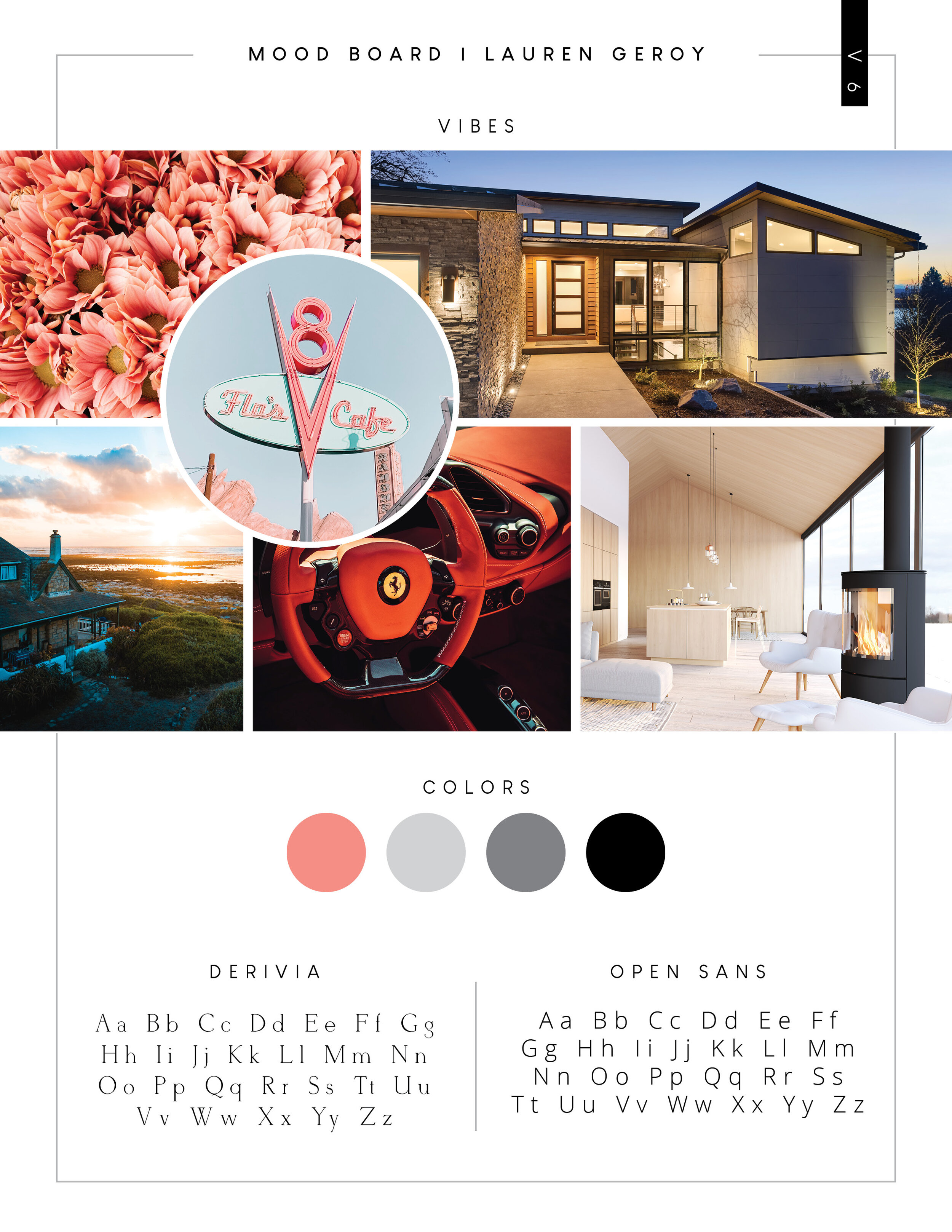
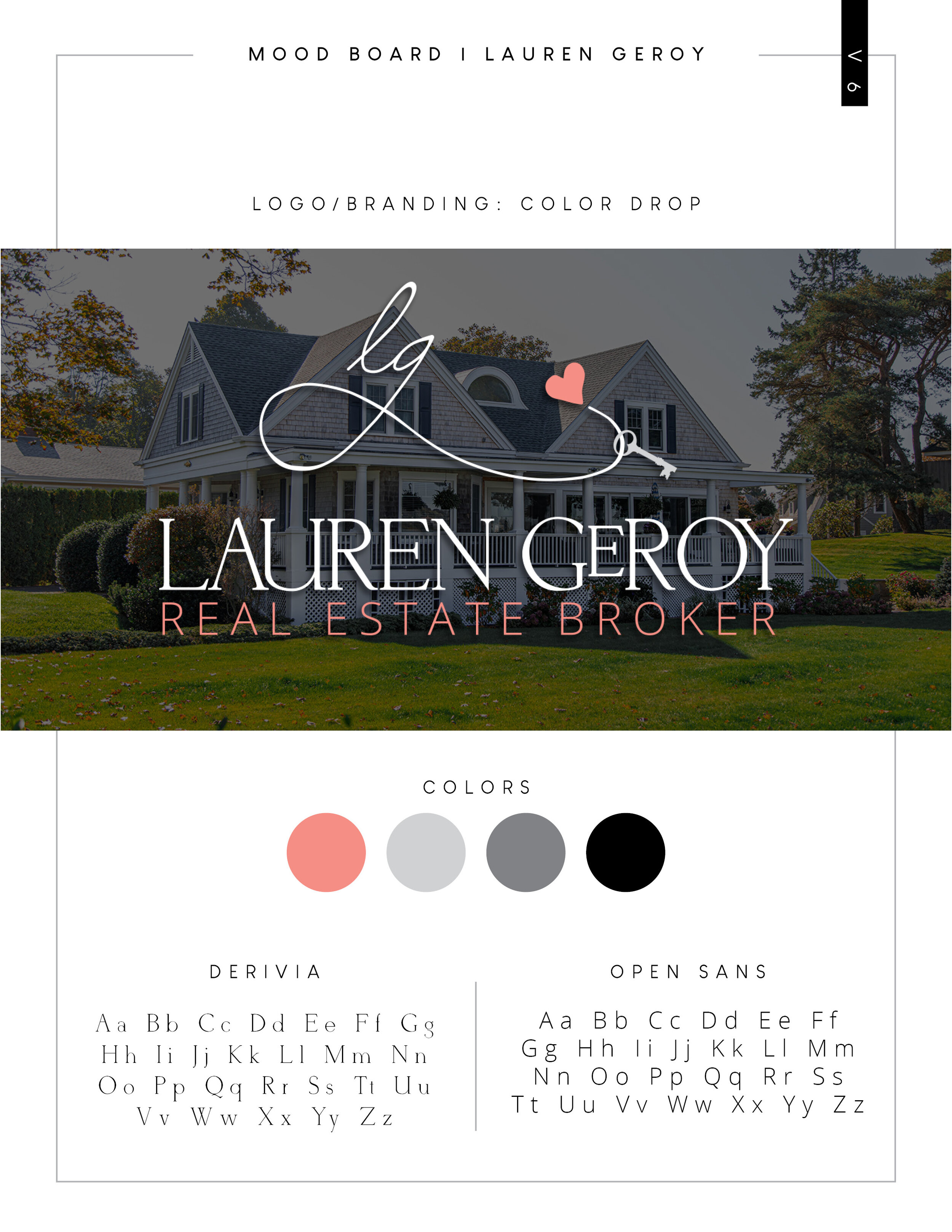
We started with a mood board, drawing on her previous design work, long conversations and a good bit of research. I regularly encourage clients to not use a logomark that include keys, doors or houses, but once in a long while a client comes along who can handle the weight of a key in their logo. We chose a salmon/coral that is at least as sparkly as she is to go along with the simple and elegant grays and blacks. The logomark can be placed in front of or above the logo and can stand on it’s own.
This project encouraged a lot of creativity and pushed us to create a website that showcases her years of sales successes and testimonials and highlights beautiful new homes every month. We included all the bells and whistles on the site but managed to keep it clean and elegant. Lauren loved it and I’m SO thrilled to add this to my portfolio!


