Summer is working on winding down, we've officially passed the Labor Day holiday, and white is no longer posh to wear in public. This summer has taken a turn away from real estate (only a smidge) and it's freed me up to play with a couple of not-for-profits that need a love and hug and kiss and good design.
The board from Northwest Chess reached out to me with a doozie of a project, complete with years of data, and a website that needed a major upgrade.
As per usual, we started with logo design; their old logo needed a refresh, something cleaner with a more modern bent. Chess tends to attract older folks, and their goal was to include the current and upcoming generations.
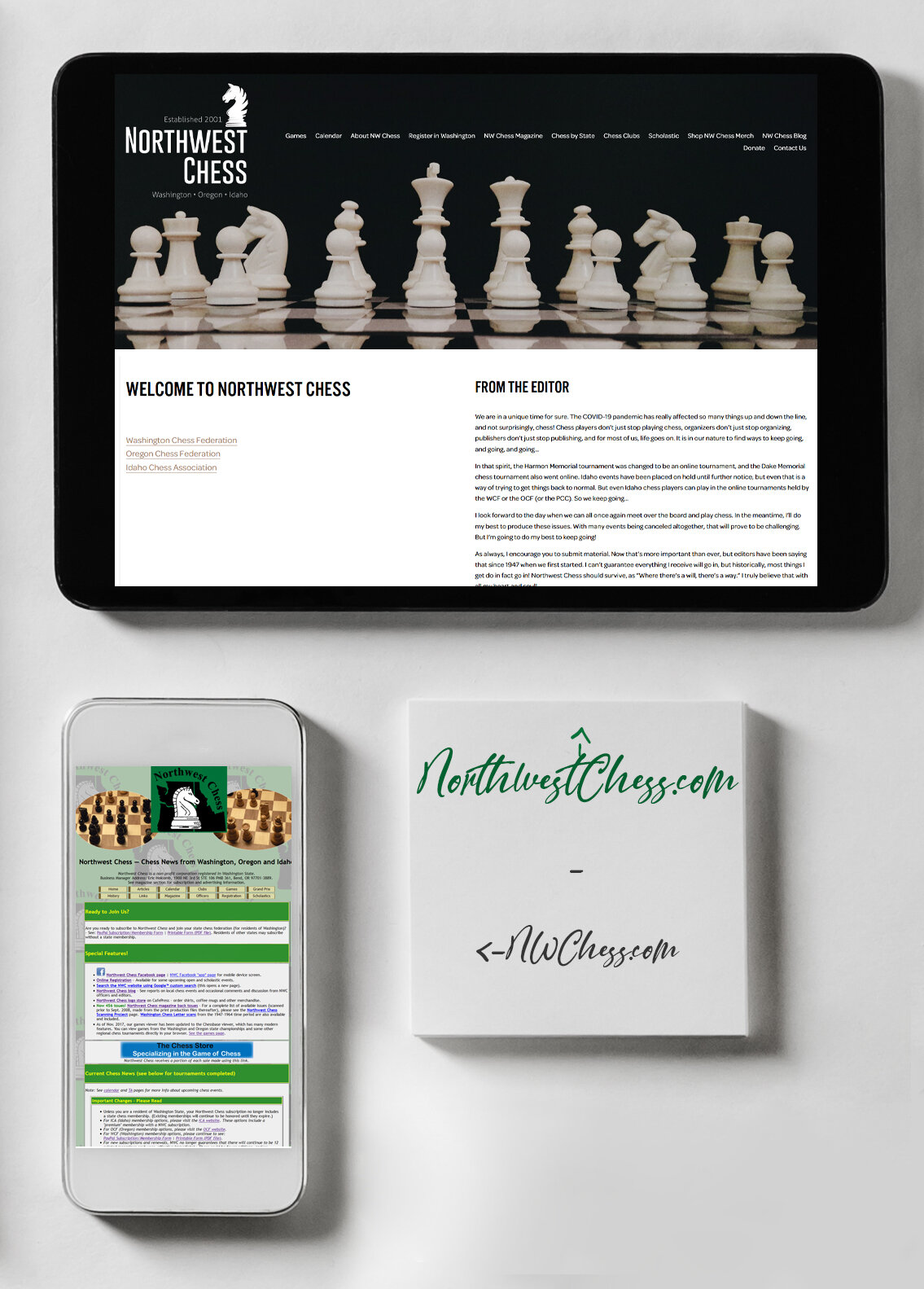
Previous Logo
I dove into their old website and worked to gather as much data as I could; the new website needed to have all of the bells and whistles without losing all the work put into the previous website. We wanted all the games available as well so that anyone could pop in and research their opponents. And we added a blog to keep everyone up to date.
I'm beyond pleased with the results of my hard work and all the work the NW Chess team put into it as well.


